IN WHAT WAY DOES THE BRAIN SEE COLORS?
A pinch of philosophy to begin with
Trying to answer the title question: “In what way does the brain see colors?” we cannot avoid the answer to a much more basic question about the colorfulness of what the brain or the world might see. In other words, the point is whether the reality around us is colorful. Everyday experience constantly confirms us in this belief. However, the colorfulness of the world is not as obvious as it might appear at first glance. First of all, if we want to give some information about the world around us, we must first agree on where the world ends and where the one who explores it begins. A key point is deciding where the boundary between the world-which-surrounds me and the seeing self, lies. In fact, it is our seeing self that experiences the colorfulness of the world and states something about it.
My intention is to signal the problem that is important for understanding what perception is, rather than write some naive philosophy paper. The most obvious answer that comes to mind about the boundary between seeing self and the-world-around-me is based on the observation that what separates me from the world is simply my skin. Everything outside my skin is not me, and, therefore, it belongs to the world I recognise. The paradox is that by accepting such an assumption as obvious we must reject another, equally obvious, one.
If the skin is my boundary separating me from the world, then the world is colorless. The grass is not green and the sky is not blue. It is only an illusion which my eyes and the brain – located in the leather sack of my body – show me. Furthermore, from this point of view, the world is not only colorless, but worse – it is not even dark-grey! The categories of brightness – just like the categories of colorfulness – are not the properties of light, but of the person who is sensitive to them.
In order to understand this obviousness, let us think about what has already been indicated on the pages of this book. Visible light (in fact, an electromagnetic wave in the range of about 400–700 nanometres and variable amplitude) stimulates photoreceptors in the retina. And that is all we know about this wave. Although we associate color with one or another light length, nevertheless, it is neither light nor dark, nor colorful. These are simply some photoreceptors that react more intensively to a certain length and amplitude of this wave, and the brain interprets their response, creating the impression of color with a certain intensity and brightness.
Obviously, I do not want to be boring, but once again I would remind that we still have no idea how the color vision is generated based on reaction of millions of neurons involved in the processing of data recorded by photoreceptors. Let us leave this problem to professional philosophers. In any case, empirical sciences have not provided any verifiable hypothesis concerning this problem yet.
However, if we do not like the idea of the colorlessness of the world, it is necessary to consider whether it would be possible somehow to shift the boundary between seeing self and the-world-around-me, so that the reality outside me might receive some splendour. For our purposes, it would be rather difficult to justify extending our seeing self beyond the skin, since we have no reason to doubt that it is the eyes and the brain that generate colors. It would be necessary therefore to move the border of seeing self to inside the body so that those brain structures which are responsible for color vision would be on the world’s side. Thanks to this, no one could question the obvious experience of its colorfulness. Unfortunately, such an approach raises further problems only. I will draw the attention to two of them.
Firstly, all mental states, including the experience of one’s self (also the seeing self), are more or less a derivative of a whole, functioning brain. So how to separate the parts of the brain that are responsible for color vision from the ones that generate our sense of self? And secondly, the introduction to our reasoning of some immaterial or non-neuronal element that would be responsible for the existence of the self (in each of its roles), in opposition to the states of mind resulting from its cognitive activity, e.g. the color vision, would throw us beyond the boundaries of empirical science in the sense that currently belongs to this concept.
Therefore, there is probably no sense in developing these points further, because they would exceed the scope of this book. It is enough to say that the concept according to which the world is colorless and non-bright, and the border of our seeing self is on the cornea of the eye, seems to be the most sensible solution, at least at the present stage of knowledge about vision.
Filling contours or contouring color spots?
Based on what I have written so far in relation to the perception of contours of observed things, one can formulate a general rule that objects in the visual scene are identified more accurately if their contours appear more clearly by contrasting surfaces of different brightness and if these contours are complete and not “distorted” by means of e.g. chiaroscuro.
Mike G. Harris and Glyn W. Humphreys (2002) note that when asked to draw any object, we usually start by setting the outlines, not by shading or coloring several adjacent surfaces. Apart from the fact that the lateral inhibition mechanism shaped in the course of evolution is largely responsible for this, nevertheless since childhood we have been trained to fill the contour pictures with different colors (as in e.g. Fig. 107) rather than contouring the colored surfaces. And we do so ignoring the fact that the vast majority of objects do not have any contour lines. That what we see are just surfaces of different colors or — in low light — of different brightness, that mark the boundaries of objects separating them from the background.
So what role do colors play in perceiving the world around us? Do we need them to identify objects? Or maybe color vision is just an extra addition that evolution has equipped us with?
On the one hand, the ratio of the number of cones that are responsible for color vision to the number of rods that respond to the brightness of the light in low light conditions is approx. 1:20. This means that we can doubt if we need color vision for anything. On the other hand, there are incomparably more cones than rodes around the fovea, which is a special place because of visual acuity. Therefore, one can rightly assume that vision mediated by color-sensitive cones, however, plays a special role in viewing the world.
It appears that without looking at the mechanisms responsible for color vision we will not solve these dilemmas. It is worth starting this story by recalling some facts from history.
Young-Helmholtz trichromatic theory
Young-Helmholtz trichromatic theory was created in the 18th century, and its precursors were the British men: Sir Isaak Newton, George Palmer and Sir Thomas Young. The first of them laid the cornerstone for both modern optics and the theory of color vision. The results of his experiments on the splitting of white light into the color spectrum negated the centuries-old tradition, according to which it was not light, but objects that caused us to see colors.
Before, color was thought to be the property of objects, not vision. People thought that light brings out colors from objects and thus they are perceived by the observer. All cats are grey after dark because there is too little light to reveal their actual color. We just need to turn on the lamp and we can immediately see that a cat is ginger, for example. Newton questioned this idea. He pointed out that the object itself, depending on the intensity and quality, i.e. the shade of the light falling on it, can cause completely different color experience. On this basis, he concluded that color vision is much more a derivative of the vision system than of the properties of the objects viewed.
Fascinated by Newton’s discoveries, George Palmer in a book published in 1777 suggested that the nerve fibres that make up the retina of the eye contain three types of coloring particles. Each of these particles absorbs rays of light with a length corresponding to one of the colors: red, yellow or blue. According to Palmer, perceiving different colors is the result of mixing of two or three coloring particles in the eye in the proportion in which they absorb light of the length they are sensitive to. Palmer was a chemist and therefore he explained the color vision mechanism by analogy with the process of paint mixing, i.e. subtractive color synthesis (Fig. 108).
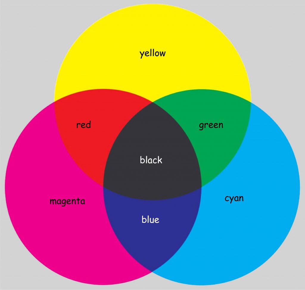
According to Palmer, the impression of green arises as a result of mixing of two coloring particles that have absorbed rays of light of a length corresponding to yellow and cyan, i.e. blue color hue. Red is a derivative of a mixture of colors that absorb light of a length corresponding to yellow and magenta, and blue — a derivative of magenta and cyan. The light absorbed by all three types of molecules gives the impression of black, while white is a consequence of the lack of stimulation of any of the retinal colors (Lowengard, 2006).
Georges Palmer built his concept on two pillars: Newtonian optics and the theory of color mixing, developed by French chemists, Charles Dufay and Jean Hellot. His concept survived for the next 30 years, but caused much controversy. First of all, Palmer could not explain why the coloring particles he postulated would only react to the three wavelengths of light indicated by him. Is it possible that the remaining wavelengths of visible light play no role in color vision? And secondly, with the development of physiology, his concept of nerve fibres, in which — according to Palmer — three coloring particles would mix like in tiny crucibles, raised more and more doubt.
In 1807, Sir Thomas Young, during lectures on natural philosophy, presented the concept according to which the retina of the eye is not built of nerve fibres filled with three coloring particles, but of three types of receptor cells that react with varying intensity to light rays covering the entire visible light spectrum. Young also suggested to, when considering color vision, depart from the idea of color mixing in the eye, as Palmer presented, referring to the analogy of paint mixing. Instead, Young postulated the concept of cumulating the strength of receptor reaction to stimulation with light waves of different lengths. Although he generally agreed with Palmer’s idea that all colors are a derivative of mixing of three components, he used the color spectrum obtained as a result of white light dispersion as the basis for their determination. He associated three points of maximum receptor sensitivity with blue, green and red (Fig. 109). His selection was obviously arbitrary, but not without logic. After dividing the entire spectrum of visible light into three parts, the colors distinguished by him definitely dominate within each category.
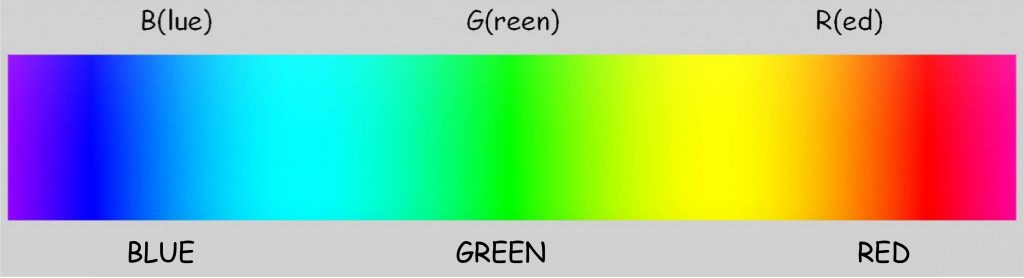
It is worth to mention that although the results of subsequent physiological studies did not fully confirm Young’s intuition regarding photoreceptor sensitivity to red, green and blue, nevertheless their division into R- (red), G- (green) and B‑cones (blue) remains valid until now.
A model description of the relationship between light wavelength and sensitivity of the three types of photoreceptors postulated by Young was presented in 1851 by a German physiologist and physicist, Hermann von Helmholtz. Like Young, he argued that perceiving different colors is associated with varying photoreceptor sensitivity to all visible wavelengths. He also believed that for each type of photoreceptor there is such a wavelength of light to which the photoreceptor is most sensitive (see Fig. 110).
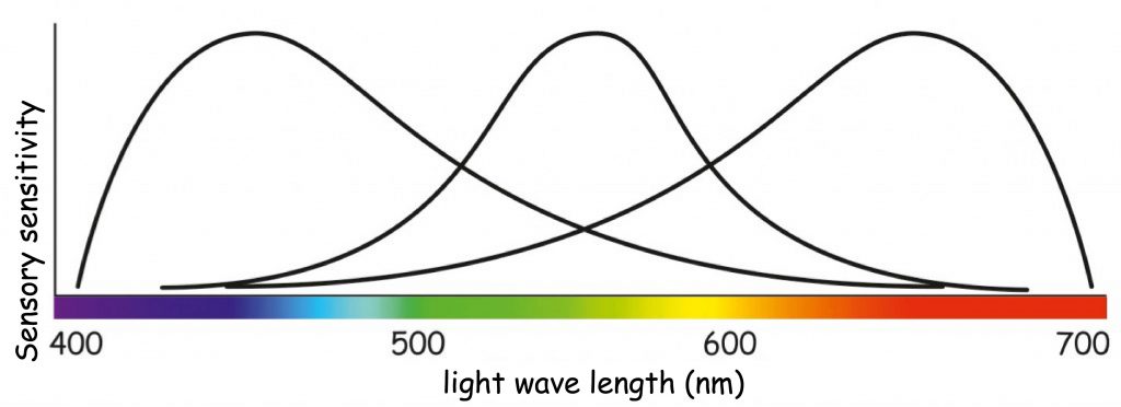
The chart in Fig. 110 shows that seeing of a color, e.g. orange, is associated with high activity of receptors that are sensitive to long wavelengths of visible light, much smaller activity to average wavelengths of light and trace activity to the shortest light waves. In turn, vision of, e.g. green, is associated with the maximum activity of receptors that are sensitive to the average wavelength of light and the slight activity of the other two types of photoreceptors. The phenomenon of color mixing as a result of cumulation of light waves of different wavelength is called additive color synthesis and, like the concept of subtractive color synthesis, it allows us to predict what color will result from a combination of two or three light components of different color (Fig. 111).
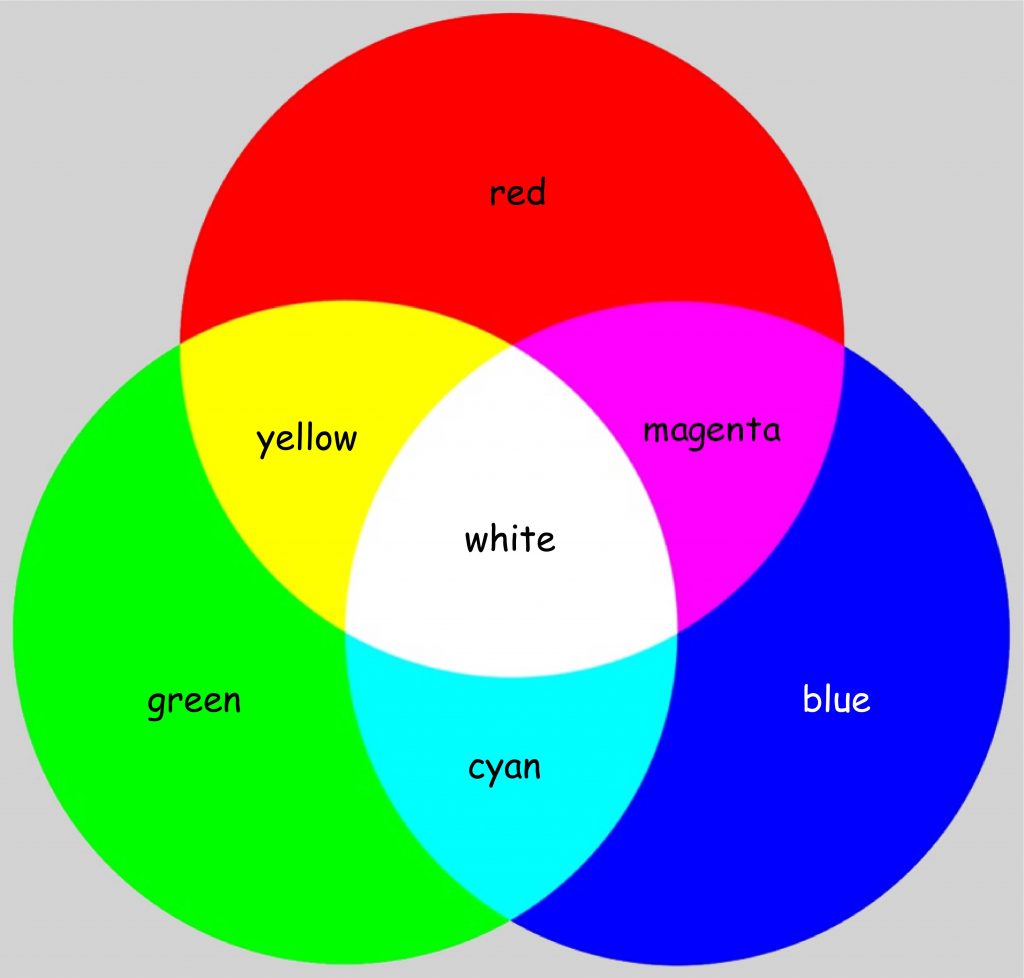
This time, the impression of the color yellow results from mixing of two streams of light with lengths corresponding to red and green. Magenta is the color resulting from two streams of light, whose length corresponds to red and blue, while the impression of cyan is created by illuminating the surface with light of the length corresponding to blue and green.
The concept of three types of receptors sensitive to light waves of different lengths developed by Young and Helmholtz was empirically confirmed in 1956 by Gunnar Svaetichin. He showed that in the retina of fish there are actually three types of photoreceptors (cones) that are particularly sensitive to three different wavelengths of light, roughly corresponding to blue, green and red — the colors postulated by Young and Helmholtz. A few years later, similar results were obtained by biophysicists from Johns Hopkins University (Marks, Dobelle and MacNichol, 1964) during the studies on photoreceptors found in the retina of monkeys, and, in the same year, biologists from Harvard University (Brown and Wald, 1964) — in reference to photoreceptors located in the human retina.
R‑, G- and B- cones or L‑, M- and S‑cones?
The actual intensity ranges of reaction of the reaction of three hypothetical types of cones to electromagnetic wave in the visible light spectrum are illustrated in Fig. 112. The chart also shows the ranges of reactivity of rods, i.e. photoreceptors active in the conditions of reduced brightness. By the way, neither Young nor Helmholtz suspected that there could be two types of photoreceptors in the eye, one of which is sensitive to intense daylight and the other is active at night. Basically, their concept only concerned the first type of receptors, i.e. cones. Maximum sensitivity of rods falls on a visible wave length of about 500 nm and a relatively low intensity (almost three times lower than the intensity of light to which the cones respond). In turn, in the group of cones there are three types of photoreceptors that have already been mentioned, sensitive to different wavelengths of light, which are interpreted by the brain as colors: red, green and blue.
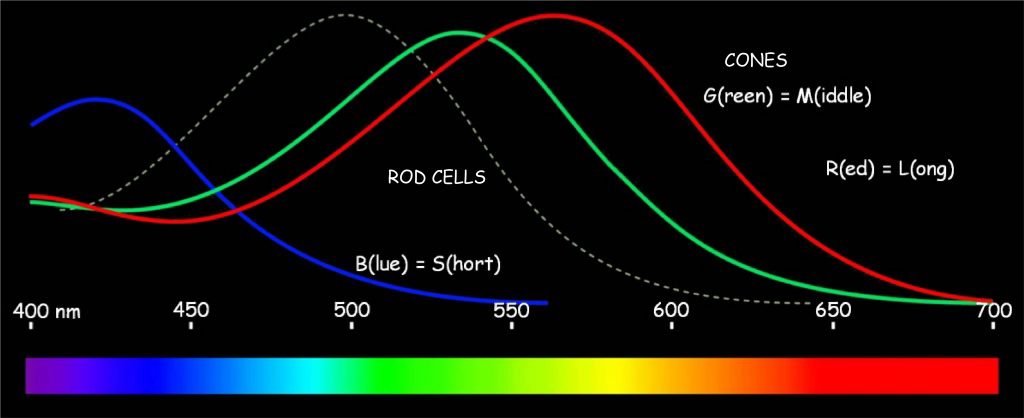
R‑cones react most intensively to the visible light wave with a length of about 560 nm. As of all the photoreceptors they are the ones that are sensitive to the longest electromagnetic wave in the visible light spectrum, they are also called L‑type cones (L for long). This wavelength does not quite match the red color, but the impression of red is actually created as a result of this photoreceptor only in a slightly more complicated way than described by Young-Helmholtz theory. This will be discussed later. G‑type cones are the ones that most intensively react to the electromagnetic wave with a length of about 530 nm. Since their maximum sensitivity falls on a wave of visible light with an intermediate length between long and short, they are also marked with the letter M (middle). In turn, cone of type B or, in other words, type S (short) react most intensively to blue light with a length of about 420 nm, because their maximum sensitivity is associated with the shortest wavelengths of visible light (Matthews, 2000).
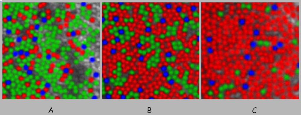
Cones of type R, G and B are not equally represented in the retina. The fewest are the cones reacting to the shortest electromagnetic wave in the visible light spectrum, i.e. blue. They constitute only 5–6% of approx. 5 million cones. This proportion is relatively constant in all people. Furthermore, cones of type B are not in fovea, and occur very irregularly in the rest of the retina (Hofer, Carroll and Williams, 2009). We do not really know the reasons, but it does not interfere with normal perception of the blue color.
On the other hand, cones of type R, which react most intensively to long wavelengths of visible light, are usually much numerous than cones of type G, which react most intensively to the medium wavelength of visible light, although it turns out that there are significant differences in their proportion in different people (Hofer, Carroll, Neitz and Williams, 2005). While maintaining the normal ability to differentiate red and green, in some people the ratio of cones of type R to type G can be from 1.9:1 to 16.5:1, but there are also those in which it is inverted, e.g. 0, 37:1 (Fig. 113). Anyhow, only R- and G‑cones are found in the fovea.
The range of color vision due to the distribution of cones on the retina
Since different types of cones are so unevenly distributed over the surface of the retina, it is worth realising how this relates to the range of color vision. Let us start by determining how many cones are found in different parts of the retina of the human eye. Christine A. Curcio and her team have been dealing with this issue for over 30 years (1987; 1990).
In Fig. 14 in the chapter devoted to the image content analysis system, I presented a schematic distribution of cones and rods depending on the distance from the fovea. In turn, in Fig. 114 in this chapter, we can see how many more or less cones there are in different parts of the retina. It can be seen at first glance that the disproportions are huge: from 199 thousands per mm2 in the fovea up to 2 thousands on the periphery of the retina. But the incidence of cones varies greatly also on the rest of the surface.
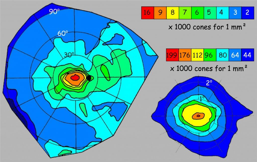
The quantitative distribution of cones, shown in Fig. 114 tells us something about resolution that translates into clarity of vision in good lighting conditions. However, it says nothing about color vision, and cones R, G and B are also distributed unevenly on the retina. This causes some problems with accurate recognition of individual colors depending on how far from the fovea a light wave of a certain length is projected onto the retina. These relationships for the right eye are presented in Fig. 115 (the image for the left eye is symmetrical).
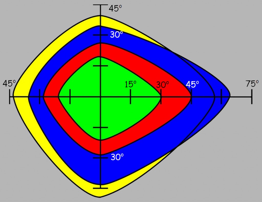
First of all, it turns out that at a distance greater than 45o from the fovea, recognition of almost all colors is significantly reduced. We can also state that blue and yellow are more accurately recognised than green and red. The limits of visibility of individual colors are slightly wider. Eileen G. Ancman (1991) determined that above 83.1o the blue color is basically no longer visible, above 76.3o the red color disappears, and above 74.3o the impression of green disappears completely. Nevertheless, problems with their accurate recognition start much earlier.
Let’s try to translate this data into the situation of viewing a large painting, e.g. The Battle of Grunwald by Jan Matejko (Fig. 116). The painting is indeed impressive: 4.26 m high and 9.87 m wide. Using the formulas that we used to estimate the range of sharp vision, it is very easy to determine how many centimeters fall within 15o, 30o, 45o, and 60o of the field of vision angle, if we view the painting from a distance of, e.g. 5 m. And so, 15o corresponds to approx. 1.3 m [2 x tg (15o / 2) x 5 m], 30o – 2.7 m, 45o – 4.1 m and 60o – 5.8 m. Now we only have to transfer these measures to the painting and discover several regularities to our surprise.
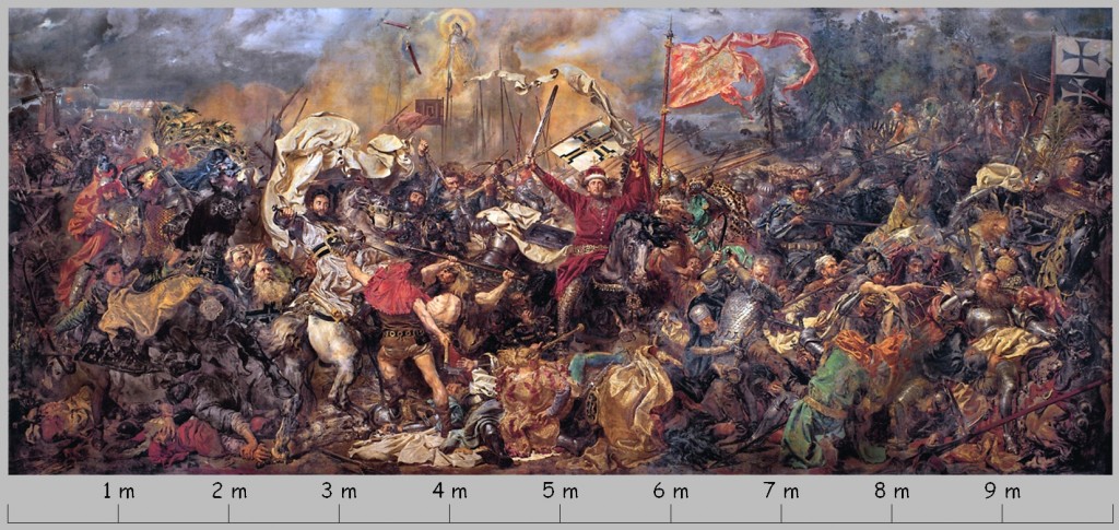
Let’s suppose that we are looking at the cord of Markwar von Salzbach, Brandenburg commander on the right side of the painting, approx. 9 m from its left edge. When asked suddenly about the color of zhupan of Vytautas (about 5.5 m from the left) or about the color of the hood of a warrior standing with an axe by the Grand Master of the Teutonic Knights (about 3.5 m from the left), we can have a serious problem, because those are situated on the border of accurate recognition of red color. In turn, focusing on the left side of the painting, where against the background of dispersed red robes one can see the figure of Jakub Skarbek from Góra, attacking Casimir V, the Duke of Szczecin, depicted in a helmet with a powerful plume, we would rather not correctly recognise correctly the color of the zhupan, but even more the color of green robes of the commander of Tuchola, Heinrich von Schwelborn, dying from the sword of the Czech knight Jan Žižka (about 7.5 m).
By the way, it is worth recalling that Jan Matejko had a significant vision defect from birth, which practically prevented him from seeing his works in full. He watched them while painting only from a perspective of several centimetres, which significantly narrowed his field of color recognition! He could see his paintings only in his imagination.
The opponent-process theory by Ewald Hering
After a short visit to the National Museum in Warsaw, let’s stay in 1878, when Jan Matejko completed The Battle of Grunwald. It was then that Ewald Hering, a German physiologist, published the theory of color vision, based on opponent process theory. It was an alternative concept to the then “applicable” Young-Helmholtz trichromatic theory of color vision. Hering also based his theory on the results of Newton’s research on the dispersion of white light into variegated components. However, he rejected the hypothesis of a triad of receptors sensitive to red, green and blue, claiming that the idea does not explain the subjective impression of yellow, “as pure and primal as red, green and blue.
Hering noticed that as a result of mixing of some colors in different proportions, new shades are created, which constitute tonal transition between them, and mixing other colors does not give such effects. For example, shades of orange are a transitional form between red and yellow. Just like shades of purple are saturated with red and blue to varying degrees. However, there are also color combinations that do not create transitional forms, but completely new qualities. For example, adding yellow and blue creates a completely new quality, i.e. green. In turn, the combination of green and red gives the color of mud. On the basis of the considerations concerning the subjective experience of seeing colors, Hering came to the conclusion that the retina should contain cells that form pairs responsible for the perception of opposing colors: red and green as well as blue and yellow, namely those, which create new qualities, not intermediate forms, when they mix together.
Formulating his concept, Hering drew attention to Newton’s attempts to geometricize the color space, which resulted in his description of the entire spectrum of visible light in the form of a color wheel (Fig. 117 A). Young and Helmholtz ignored this element of Newton’s concept and stopped at a linear description of the color sequence in accordance with the increasing length of the corresponding light waves (see Fig. 110).
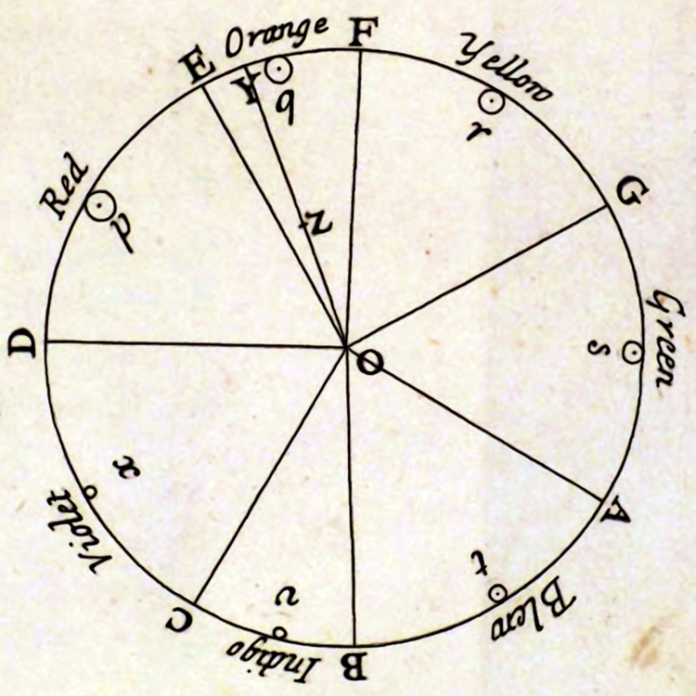
Hering, in turn, was very fond of the idea of presenting colors in the form of a circle, because he noticed that their distribution perfectly corresponds to the red and green, yellow and blue oppositions noticed by him. Lying on opposite sides of the circle, opposing colors do not create transitional forms with each other; they create transitional forms with colors belonging to the second pair. Hering presented Newton’s color distribution on the wheel in a slightly more schematic form, suggesting that the four basic colors — red, yellow, green and blue — divide the color wheel into four parts, occupying a dominant position within each of them (Fig. 117 B).
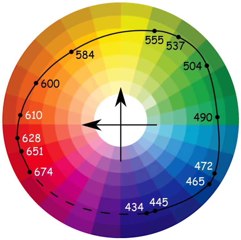
If Ewald Hering lived to be 128, he could feel fully satisfied after reading the article by Roger N. Shepard (1962), devoted to an attempt to empirically reproduce the mental similarity structure of 14 colors selected in the wavelength range from 434 nm to 674 nm by Gösta Ekman (1954). The task of the individuals tested in the Shepard’s experiment was to compare all these colors in pairs. It turned out that from a psychometric point of view, the two-dimensional solution is completely satisfying and almost exactly reproduces the Newtonian structure of the relationship between colors. And most importantly, the test result also confirmed the color oppositions suggested by Hering (Fig. 118).
Roger N. Shepard and Lynn A. Cooper (1992) once again conducted analogous studies in the group of people with normal vision and in the group of people suffering from deuteranopia (inability to recognise green color) and protanopia (inability to recognise red color), as well as people blind since birth. They also reduced the number of compared colors to nine and presented stimuli both in visual form (colored cardboards) and in the form of names. It turned out that the distribution of colors through names was identical in all groups, except for those who were blind from birth. However, significant differences between the groups occurred when the colors were presented in a visual form.
Another support for the concept of Hering’s opposing colors is the experience of afterimage (Fig. 119). It is a type of visual illusion resulting from long-term stimulation of different parts of the retina with different colors.
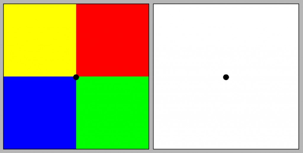
To evoke the afterimage, focus your eyes for 30 seconds on the black point lying at the junction of four colored squares on the left. Then move to the right panel and focus on the centre point as well. Unexpectedly, four squares in complementary colors will appear on the white plane, i.e. in the place of the color yellow we will see a color similar to blue, in the place of red — green, etc. According to Hering, the fact that afterimages use opposing colors is another support for his concept of color vision based on opposing processes.
In addition to postulating the two mechanisms underlying the view of opposing colors, Hering also drew attention to the third opposition, this time in terms of luminance, i.e. brightness of lighting. He claimed that the loss of color vision, e.g. in low-light conditions, is independent of the ability to distinguish degrees of image brightness in the range of white to black. According to Hering, the third type of receptor must be responsible for coding of brightness, and therefore also the third opposing mechanism, independent of those that underlie the perception of opposing colors.
Hering located all three perceptive mechanisms in receptors located in the retina of the eye. Rejecting the division of receptors into three types, postulated by Young and Helmholtz, specialised in the perception of red, green and blue, he also proposed a triple division of receptors, but according to completely new criteria. He assumed that there are receptors in the retina responsible for encoding red and green, yellow and blue as well as white and black (Fig. 120).
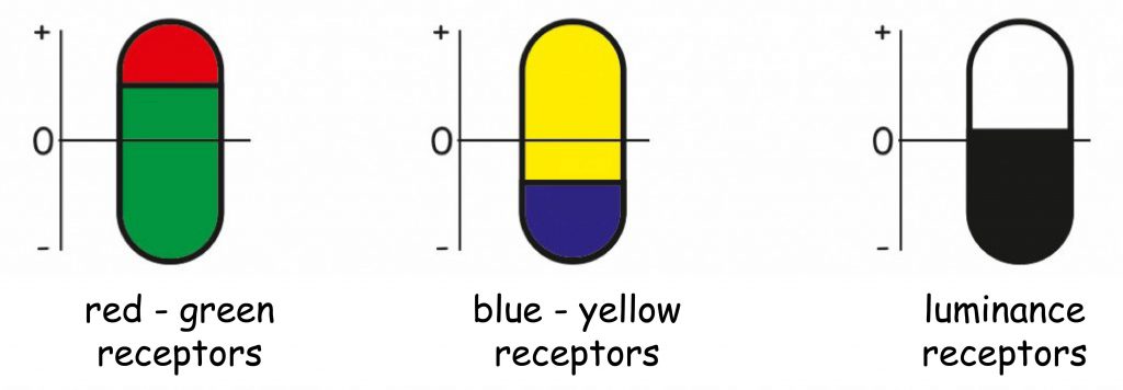
In his opinion, the principle of operation of all types of receptors is based on the reconstruction or decay of the same chemical inside them. For example, an increase in red-green receptors, while zeroing their state in blue-yellow and black-and-white receptors would be the basis for the sensation of red. If this was accompanied by decay at the same time, i.e. a decrease in the amount of chemical substance in the blue-yellow receptors, then we would have the impression of violet or purple, etc. The direct reason for the decay or accumulation of a chemical substance in individual receptors is — according to Hering — light of a certain length.
Müller-Hurvich-Jameson zone theory of color vision
Until the 1930s, the Young-Helmholtz trichromatic theory and the Hering’s theory of opposing processes were treated as two contradictory concepts explaining the mechanism of color vision. George Elias Müller proposed a solution to this theoretical deadlock (1930 — after: Klein, 2010). He presented the concept of color coding zones on the visual pathway (zone theory). According to his suggestion, the first zone is associated with the reactivity of retinal photoreceptors sensitive to red, green and blue light. The second zone is the visual pathway on the segment of the retina of the eye — the cerebral cortex and the third, associated with the activity of cortical structures. Müller’s intuitions proved to be extremely accurate.
The first zone, covering structures inside the retina of the eye, including R, G and B receptors, has been quite decently described by Young and Helmholtz as part of the trichromatic theory of color vision. The second zone is associated with the structure of connections and activity of ganglion cells, which output the signal from the eye retina to LGN and further to the cortical structures of the brain. Data from photoreceptors is ordered in this section exactly as Hering described it in his theory of opposing processes. Finally, a third color coding zone, covering the cortical areas of the brain, ranging from the blob areas in V1, to the V4 structure in the temporal lobes which was described by Semir Zeki (1973; 1993; 1999; 2003), and by Edwin H. Land and John J. McCann (1971) in the theory of color vision stability retinex.
The concept of color vision zones proposed by Müller in the 1930s was largely confirmed empirically in physiological and neurological studies only thirty years later. Before this happened, however, Leo Hurvich and Dorthea Jameson (1957), based on Müller’s ideas, conducted empirical research whose purpose was to verify the theory of opposing processes by establishing the relationship between perceived colors and the corresponding wavelengths of visible light.
Hurvich and Jameson attempted to quantify the course of opposing processes using psychophysical methods. Just as Müller, they assumed that in the second zone of the visual pathway data from three types of photoreceptors sensitive to red, green and blue light generate impressions in the range of four primary colors that are mutually exclusive in pairs (red vs green and blue vs yellow). If this is the case, then in the full spectrum of visible light it is possible to empirically determine the electromagnetic wavelengths that correspond to both the maximum and minimum values of color saturation in both pairs. By analogy, we can also determine the wavelengths that are responsible for different degrees of brightness in the dimension: white vs black.
Persons participating in the experiments carried out by Hurvich and Jameson made a series of assessments regarding the content of a given color, e.g. blue, in all colors from the entire spectrum of visible light. A similar task concerned the other three colors: yellow, red and green.
On the basis of the collected data, Hurvich and Jameson described not only the relationship between the length of the light wave and the perceived intensity of each of the four colors, but above all determined the electromagnetic wavelengths that corresponded to the zero intensity of the opposing colors in pairs. Similarly, the relationship between the wavelength of the light and the perceived brightness of light has been described (see Fig. 121).
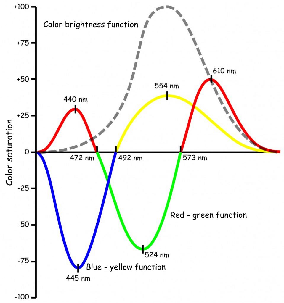
Based on empirically determined functions shown in Fig. 121 it can be seen that four basic colors are perceived in two oppositions: blue-yellow and red-green. The impression of a pure blue color is generated by a visible wave of 445 nm and a wave of 554 nm — yellow. In turn, the 492 nm wavelength gives the impression of a green color, which is completely devoid of both yellow and blue. This is a neutral transition point suggested by Hering and Müller between these two opposing colors.
The situation regarding the opposition of red and green is slightly more complex. The impression of pure green corresponds to a wavelength of 524 nm, while the impression of pure red is a component of two colors: red, with a visible light length of 610 nm and purple, with a length of 440 nm. Colors completely devoid of red and green, i.e. neutral colors for this opposition, are blue (472 nm) and yellow (573 nm).
The last of the functions presented in Fig. 121 is a brightness function. Based on the course of this function, we can conclude that the maximum brightness is related to the wavelength of the light corresponding to pure yellow and it decreases symmetrically with the elongation and shortening of the electromagnetic wavelength towards the ends of the visible light spectrum.
The results of research conducted by Hurvich and Jameson confirmed the theory of Hering’s opposing processes in psychophysical studies. The issue of neurophysiological foundations of these processes remains to be clarified, i.e. we need the answer to the question how it happens that on the basis of data from three receptors sensitive to red, green and blue light, the impression of yellow color vision and the impression of different degrees of brightness arise. Appropriate theory was already coming.
From stimulation of R‑, G- and B‑cones to opponent-color vision
The discovery of the relationship between the sensitivity of three types of cones in the retina of the eye to the wavelength of visible light and the vision of opposing colors, described in the theory of opposing processes, was made on the basis of the results of research on the reactions of ganglion cells that discharge the signal from the retina of the eye to the lateral geniculate nucleus (LGN). As we remember, LGN is located about halfway between the retinas and the cerebral cortex.
First, Edward F. MacNichol and Gunnar Svaetichin (1958), conducting research on goldfish, and a few years later Russell L. de Valois (1960) in similar studies conducted on monkeys, discovered that the activity of some ganglion cells in LGN significantly increases when light of the length corresponding to the color, e.g. red, falls on the retina, while the reaction of these cells decreases under the influence of green light. In turn, other cells react in the opposite way: green light clearly stimulates them, but under the influence of red light their activity decreases. What is more, ganglion cells have also been found to react intensively to blue light, and their activity decreases markedly when the light turns yellow. And finally, there are cells that react intensively to yellow light while their activity is slowed down under the influence of blue light. These studies also identified cells that respond to bright light and do not respond to weak light, and cells that activate under low light and do not respond to bright light.
Stephen E. Palmer (1999) defines the reactions of all these types of ganglion cells as a neuronal implementation of Hering’s opponent processes theory. The basis of action of these cells is the mechanism of activity of bipolar and ganglion cells forming the so-called ON and OFF channels. Let us remember that photoreceptors are interconnected in circular receptive fields of horizontal cells on the majority of the retinal surface. Photoreceptors located in the central parts of these fields additionally connect with bipolar ON or OFF cells, and those in turn with ganglion cells also of ON or OFF type, respectively. The mechanism for transmitting data on the length of visible light in the spectrum of opponent colors via these channels is analogous to the mechanism for coding of the brightness of light falling on the receptive field, described in one of the previous chapters.
If the reception area of a ganglion cell, e.g. ON type, is organised so that its central part reacts to a wave of light, corresponding to the green color, then when it is illuminated with such light, information about the presence of green is transmitted to LGN, and then to V1, and information about the presence of red is inhibited. However, if the central part of the ganglion cell receptive field is of the OFF type, then the information about the illumination of this part of the retina with light corresponding to the green color is inhibited, and the information about the presence of the red color is transferred. ON and OFF channels work similarly in relation to the pair of blue and yellow colors (Daw, 2008).
What remains to be clarified is the relationship between the reaction of ganglion cells encoding one of the four primary colors and the reactivity of R, G and B photoreceptors. This issue has not been explained to this day, but Russell L. de Valois, Israel Abramov and Gerald H. Jacobs (1966) proposed a solution that has not yet been challenged. Its graphic illustration is shown in Fig. 122.
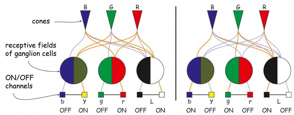
According to the scheme shown in Fig. 122, the impression of red may arise as a result of:
- activation of the ON channel for the receptive field, which in the central part receives data on the level of stimulation of R- and B‑cones or
- activation of the OFF-channel for the receptive field, which receives data on the level of stimulation of R- and B‑cones from the areola.
In turn, the impression of green can arise as a result of:
- activation of the ON channel for the receptive field, which in the central part receives data on the level of stimulation of G‑cones or
- activation of the OFF-channel for the receptive field, which receives data on the level of stimulation of G‑cones from the areola.
The impression of yellow also arises in one of two situations:
- activation of the ON channel for the receptive field, which in the central part receives data on the level of stimulation of R- and G‑cones, or
- activation of the OFF-channel for the receptive field, which receives data on the level of stimulation of R- and G‑cones from the areola.
Also the impression of blue can arise in two situations:
- activation of the ON channel for the receptive field, which in the central part receives data on the level of stimulation of B‑cones or
- activation of the OFF-channel for the receptive field, which receives data on the level of stimulation of B‑cones from the areola.
Obviously, the impression of any color arises only when all the subsystems responsible for sensory data processing at each stage of visual pathway work efficiently. If not, the final effects of data processing may even differ significantly from those described in the above schemes.
And finally, a reminder on how the brightness (luminance) detection mechanism works. The impression of brightness can arise as a result of:
- activation of the ON channel for the receptive field, which in the central part receives data on the level of stimulation of all types of cones or
- activation of the OFF-channel for the receptive field, which receives data on the level of stimulation of all types of cones from the areola.
Due to the different light brightness coupled with different electromagnetic wavelength, the stimulation level of R- and G‑cones will have a much greater impact on brightness than B‑cones, because their maximum sensitivity level – 560 and 530 nm respectively – coincides with such a light wavelength that is the brightest, i.e. approx. 550 nm (see graph of the brightness function in Fig. 121).
COLORS IN PAINTINGS
In the history of art, the history of color and its theory is an oscillation between degradation to the role of an ornament or decoration and a promotion to the basic truth of painting (Melville, 1994)
On Claude Monet’s visual experiments
When equipped with the knowledge of color vision, can we better understand why painters or photographers use color in one way or another and what visual effects they achieve? The first example of a painting that I would like to draw attention to is Impression, Sunrise by Claude Monet (Fig. 123 A).
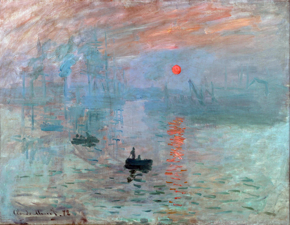
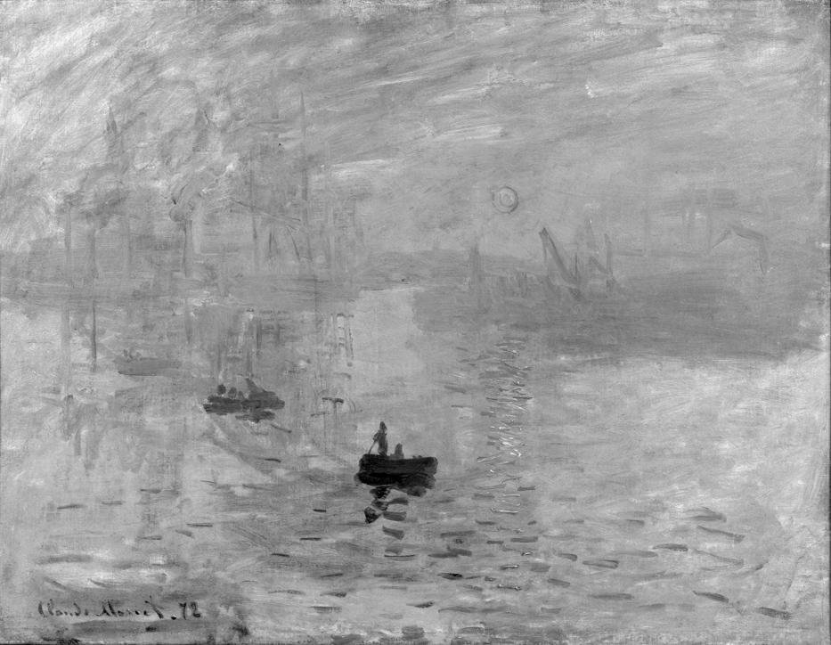
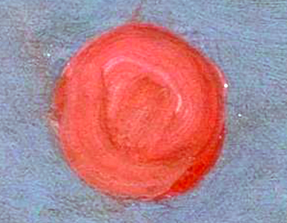
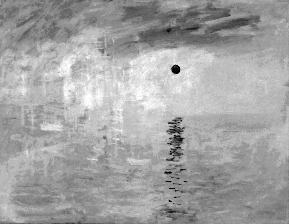
When admiring the reproduction of this painting in the album, Margaret Livingstone (2002) noticed an interesting phenomenon. The blood-red sphere of the rising sun, almost imposing on the observer, ceases to arouse interest when it is viewed in a monochrome version (Fig 123 B). In her opinion, removing colors makes the sun kind of fade, although its contours are not completely invisible in the monochrome version.
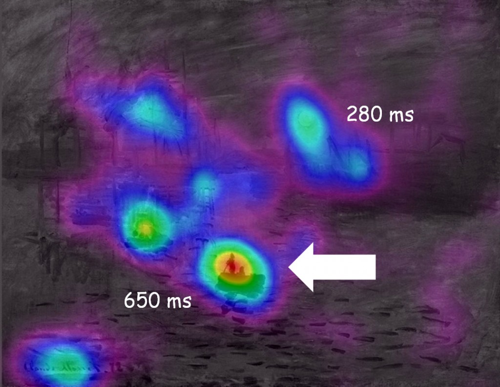
To find out if Monet’s painting is really seen differently in the original and monochrome version, we conducted a study together with Anna Szpak and Patrycja Kot, during which we showed 19 reproductions of the colorful Impression to 19 women and 19 men, and its monochrome version — to 26 women and 17 men. All individuals were approx. 22 years old. The images were displayed on a 23″ Apple Cinema HD Display (1920 x 1200 pixels). During the experiment, we recorded the eye movements of the subjects using the SMI iView X Hi Speed 1250 Hz oculograph.
We expected that interest in the area of the sun in a color image would be much greater than in the analogous area in a monochrome version. We also wondered how much attention the respondents would devote to other parts of the picture, e.g. a boat in the foreground, which is very clear in both versions of the picture. Especially with regard to the monochrome version, we assumed that it was the dark boat in the foreground that strongly contrasts with the bright sea background, should arouse much greater interest of the subjects than the area of the sun.
The oculograph recording fully confirmed Livingstone’s observations and our expectations (Fig. 123 C and D). While watching the colorful image, the subjects devoted most time to sun (Fig. C), while when watching the monochrome reproduction, they were particularly interested in the boat in the foreground (Fig. D). All differences in times of visual fixation on the same fragments of both versions of the painting and compared to other fragments within the same versions are clear and statistically significant (Tukey’s HSD test; p <0.001).
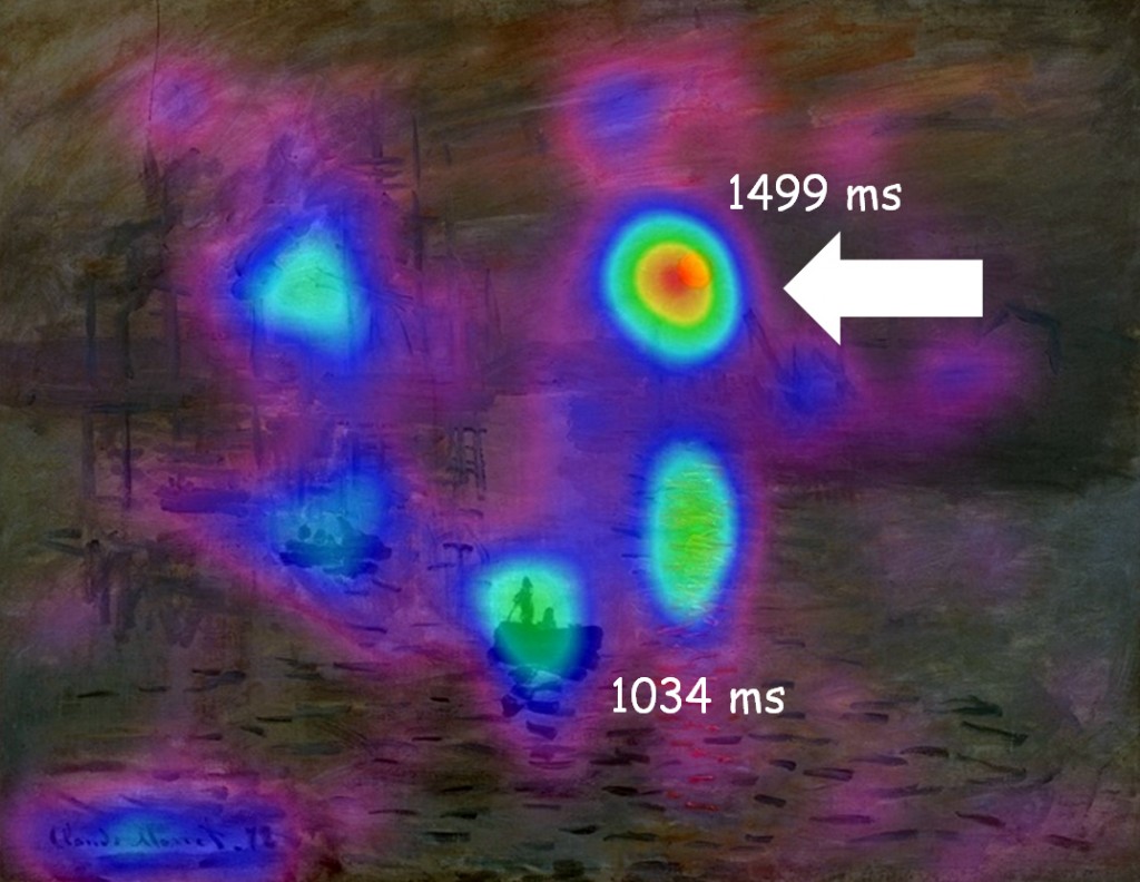
If we assume that the time spent on looking at an object is related to interest in it, then it is worth considering what aroused so much interest of the subjects in this sharply outlined red sphere against the background of the morning sky. As a curiosity, it can be added that while watching a painting in a museum and staring longer into the sun, some people experience a kind of pulsing, which probably makes them even more interested and stops their sight in this place.
According to Livingstone (2002), this weird impression comes from the fact that the visual system, by processing data on the color and image brightness independently, cannot make the most fundamental decision regarding the presence or absence of things in the visual scene. The part of the visual system that is evolutionarily much older, responsible for luminance detection, is helpless in the face of a fundamental lack of contrast between adjacent planes of the sun and sky. In turn, the evolutionarily younger part sensitive to colors registers in the painting the presence of a red circle against the blue sky. The result is an amazing eerie pulsing experience, which is the reaction of the luminance detection system to the difficulty in determining the position of an object whose presence is reported by the color detection system. In this way, we can explain the effect of the instability of the image fragment built of two adjacent colors of the same brightness. In short, the brightness of the sun is almost the same as the brightness of the background on which it was placed by “unconscious neuroscientist”, Claude Monet. And that’s the magic behind this painting.
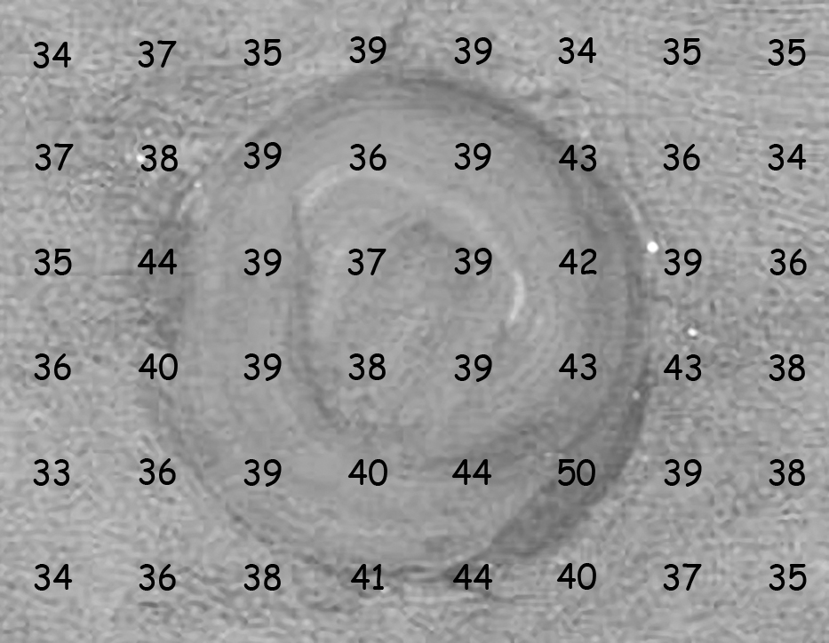
It is easy to see that the brightness of the sun and the surrounding sky is very similar. In Fig. 124 A there is an enlarged fragment of the Monet’s painting showing the sun. Below is the same fragment in the monochrome version (Fig. 124 B). I estimated and applied to it numerical values corresponding to the brightness of the areas around them. As we can see, the differences between the brightness inside and outside the sun are small. It is worth remembering that some of the darker places inside and on the edges of the sun were not created due to the use of a darker shade of red, but are a shadow cast by the thickly laid paint.
Analysis of the Monet’s painting reveals one more very important feature of the visual system, which uses the benefits of color registering. Since the observer’s luminance system has difficulty identifying the sun in Monet’s painting, and yet sees it, it can only mean that the color, like chiaroscuro, also codes the shape of the objects we look at. To confirm it, I isolated from the original version of the Monet’s painting two paintings composed only of opposing colors: red and green, and yellow and blue, setting their luminance at the same, medium level. This allowed to determine how much red, green, blue and yellow is contained in the colors that Monet used to paint it. The resulting images allow us to see the boundaries between colorful spots, and thus to read the shapes that they code. In any case, these are the predictions arising from the theory of opponent processes, built on apt intuitions of Ewald Hering. The effect of simulation of opponent processes is presented in Fig. 125 A‑D.
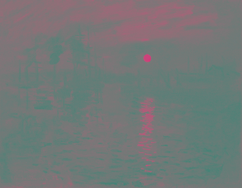
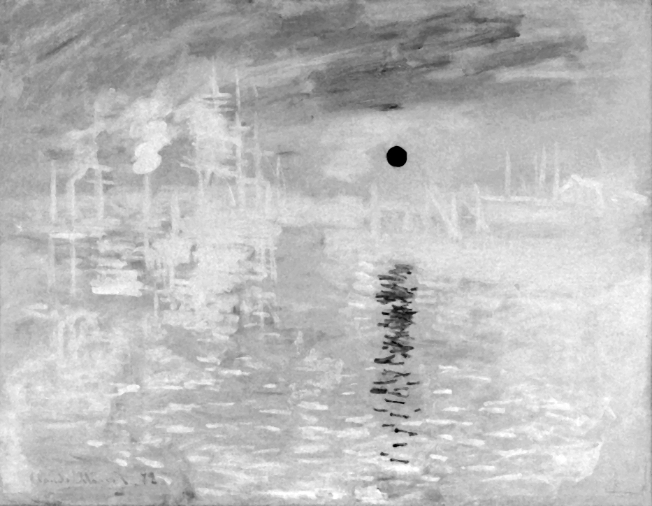
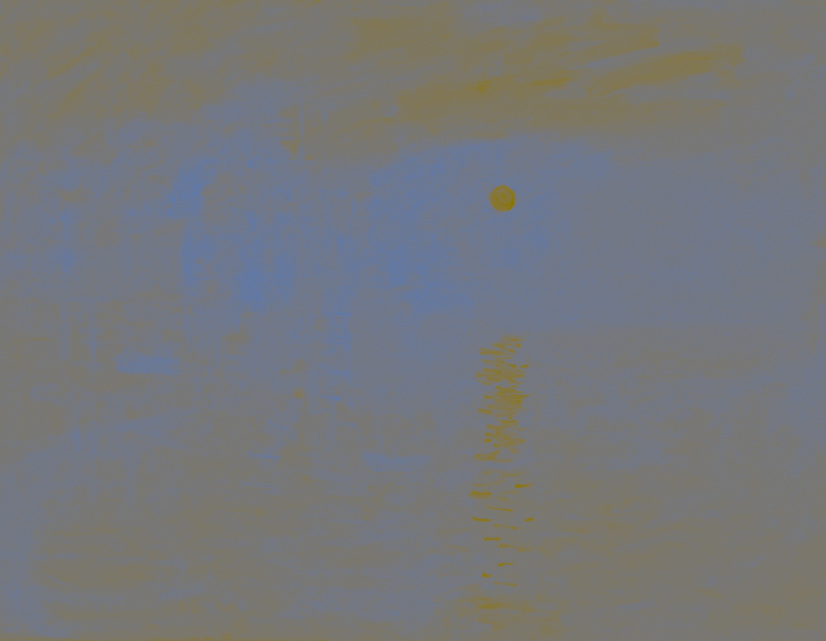
Both pairs of opposing colors in Fig. 125 A and C have the same luminance. This causes that the boundaries of colors are hardly visible, but certainly the brain has no problems to differ them, if only because they are coded with the help of various channels, made of ganglion cells that deal with the transmission of sensory data deep into the brain. For illustrative purposes only, I have also developed both versions of the painting in a high contrast monochrome version (Fig. 125 B and D). There should be no doubt now that the basis for seeing the sun in Monet’s painting is not the contrast of brightness, but the contrast of opposing colors that clearly encode the shape of the sun (see Fig. 124 B vs Fig. 125 B and D).
It is also worth noting that while watching a colorful reproduction of the painting, the second longest observed object was the dark outline of the boat in the foreground. In the context of what I wrote about the divergence of information flowing from the color channels and the luminance channel, it is difficult to determine why the test subjects spent so much time looking at this fragment of the painting. On the one hand, there is no doubt that due to the contrast of brightness it is the clearest object in the whole painting, which is clearly seen in its monochrome version (see Fig. 123 B). From this point of view, we can say that the luminance channel “allows” to unambiguously identify the object in the painting, due to its high contrast.
On the other hand, however, the boat simply disappears when the painting is filtered through both opposing color channels (Fig. 125 A‑D). Could longer looking at the boat be another manifestation of the visual conflict between the channel coding the shape based on differences in luminance and based on the diversity of opposing colors, which increases the interest of observers? Or maybe it is only a manifestation of the natural reaction of the visual system, expressed by an increased concentration of attention on those elements of the visual scene that will most accurately recreate its sense.
Well, we certainly will not be able to dispel all doubts immediately. Yet, it is worth to try to solve the problem of the sun and the reasons for special interest in it. Certainly, the analysed painting of Monet cannot be included in the set of fully controlled experimental stimuli. To draw scientific conclusions based on it, a slightly more precise model is required.
Sun by Monet under scrutiny
The essence of the so-called Monet effect, as I called the analysed phenomenon, consists in the increased interest of the observer in those areas of the visual scene that are characterised by discrepancy between the data encoding the shapes of objects there based on luminance and two color channels. To paint this fragment, Monet used red (sun) and blue (sky) with similar luminance, equal to about 40 units (see Fig. 124). Following this idea, together with Piotr Szyjka, we constructed stimuli and conducted an experiment in which an oculograph was used (Frenchman, Szyjka, 2011).
The stimulus material consisted of 48 boards. On each board there were 24 different-colored stars of the same size [32.3 mm; 125 pixels]. The stars were arranged randomly on a grey background of the same brightness [Lab = 50:0:0; RGB = 119:119:119]. Each star had its assigned random rotation angle around its axis. The distance of the centres of individual stars from each other was equal to or greater than the range of the field of vision through the fovea, i.e. at least 52.41 mm; [201.57 pixels]. In half of the boards all stars had 7 arms, while in the other half one of the 24 stars had 8 arms. On each of these boards it was always an asterisk with a different color (see an example of a board with an octagonal star in Fig. 126 A).
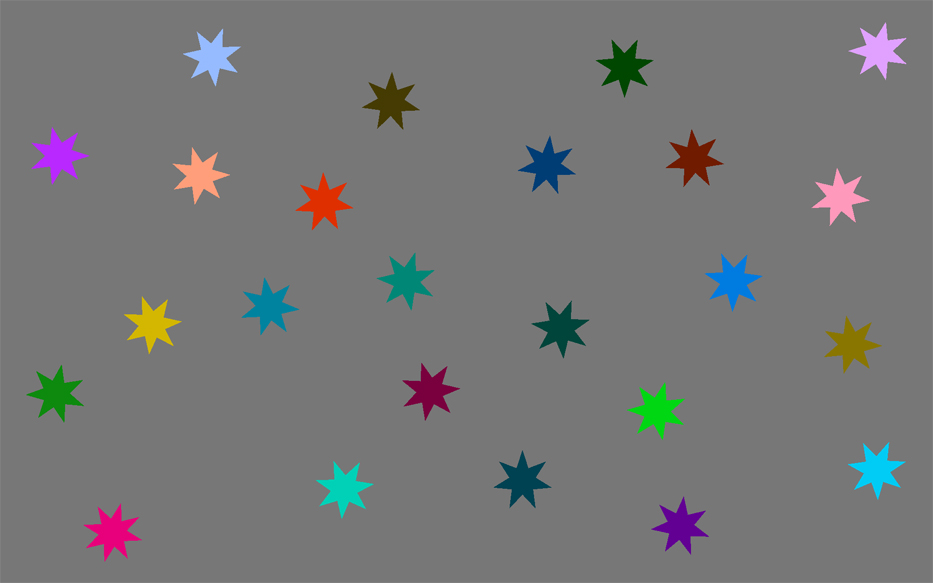

Brightness and color of individual stars were fully controlled. We adopted three levels of star brightness: L = 25 (darker than the background), L = 50, the same as the background brightness and L = 75 (brighter than the background). Each board had eight stars brighter than the background, 8 stars darker than the background, and 8 stars of the same brightness as the background. In Fig. 126 B illustrates the monochrome effect created after removing the color from the board on the left.
Colors of stars were created from a combination of parameters corresponding to limit and zero values on color scales: from red to green and from blue to yellow. As a result, we obtained 8 different colors, which in combination with three levels of luminance gave 24 different-colored and different-brightness stars, which we placed randomly on individual boards.
The number of boards presented to the examined individuals resulted from the fact that we wanted every color of each brightness level to occur at least once in the 8‑arm version. Because the subjects’ task was to answer the question whether the board has an 8‑arm star, half of the boards contained it, and the other half did not. Finally, we showed all the boards three times, in random order. We used the procedure written in the e‑Prime software to present stimuli and collect data on the responses of the subjects.
All boards were displayed on 23″ Apple Cinema HD Display (1920 by 1200 pixels). Subjects sat at a distance of about 50 cm from the monitor and reacted using an Ergodex keyboard with variable key arrangement.
We examined 23 individuals (13 women and 11 men) aged around 23 years. As I mentioned, their task was (three times in random order) to view each board and answer the question whether the shapes of all stars on the board are the same. During the study, we recorded the eye movements of the subjects using the SMI iView X Hi Speed 1250 Hz oculograph. If the test subject claimed that all stars had the same shape, then the next board appeared. If, on the other hand, the subject claimed that not all stars had the same shape, then such a person was asked to focus on the star she claimed to be different. It was an indicator of the accuracy of the response. In addition to oculomotor behaviour, we also recorded reaction time.
Although in the study we asked subjects to actively look for stars with different shapes, nevertheless, we were primarily interested in how much attention they would devote to search those stars whose luminance was the same as the background brightness compared to those whose luminance was higher or lower than the background. If the Monet effect is real, then the time spent looking at stars with a brightness equal to the background brightness should be longer than the time spent looking at other stars.
The results of the analysis of variance fully confirmed these assumptions, Not only did it turn out that the subjects looked at stars with a brightness equal to the background brightness longer than those brighter or darker [F (2, 46) = 9.77; p < 0.001; η2 = 0.30; Fig. 127 A], but this relationship was also confirmed in relation to 8‑arm stars with a luminance of 50 units [F(2, 46) = 8.79; p < 0.001; η2 = 0.28]. Moreover, it turned out that the Monet effect occurs regardless of the color of the star. The important thing is for its brightness to be the same as the background brightness.
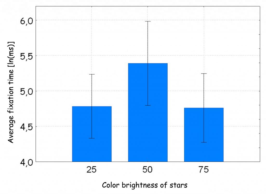
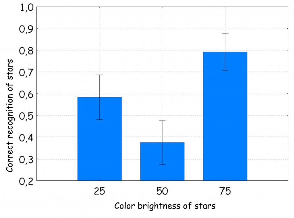
Additionally, we found that, although the test subjects devoted a lot of attention to 8‑arm stars with a brightness equal to the background brightness, nevertheless, regardless of the color of the stars, subjects rarely correctly recognised them as different from the others. For some colors, the differences turned out to be statistically significant [e.g. for the green color: F (2. 46) = 5.58, p= 0.007, η2 = 0.19; Fig. 127 B). It looks a bit like solving the problem of the presence of the star on the board due to luminance so strongly dominated subjects’ attention so strongly that they could not correctly state that a given stars has 7, and not 7 arms. Here is an example of how skilfully narrowing the observer’s field of attention by giving him a difficult perceptual task can disrupt his normal cognitive processes. When the stars are bright and clearly stand out from the background, then the probability of their accurate recognition increases to 0.8, but when their brightness becomes the same as the background — recognition accuracy drops to less than 0.4.
How many shapes are in one object?
In the light of the presented results of Monet’s painting analysis, it is worth considering what other consequences of discrepancies between the shape coded through the luminance channel and the color channels can be?
Let’s start with the example of the painting Apollo and two Muses, painted in the 18th century by Pompeo Girolamo Batoni (Fig. 128 A). The painting comes from the collection of the Wilanów Palace Museum in Warsaw. It depicts three mythological characters: Apollo, a symbol of perfect divine music — the harmony of the heavenly spheres and the muses looking at him — Euterpe and Urania, who embody Music and Astronomy (Gutowska-Dudek, 2005). This, of course, is the perspective of an art historian. On the other hand, a layman in the field of art history, watching this painting, will certainly notice a young undressed men accompanied by girls in equally airy clothes, while the behavior of all three characters “stopped in the frame” can give at least ambiguous impression (Frenchman, 2012).
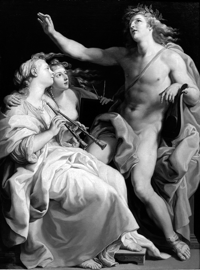
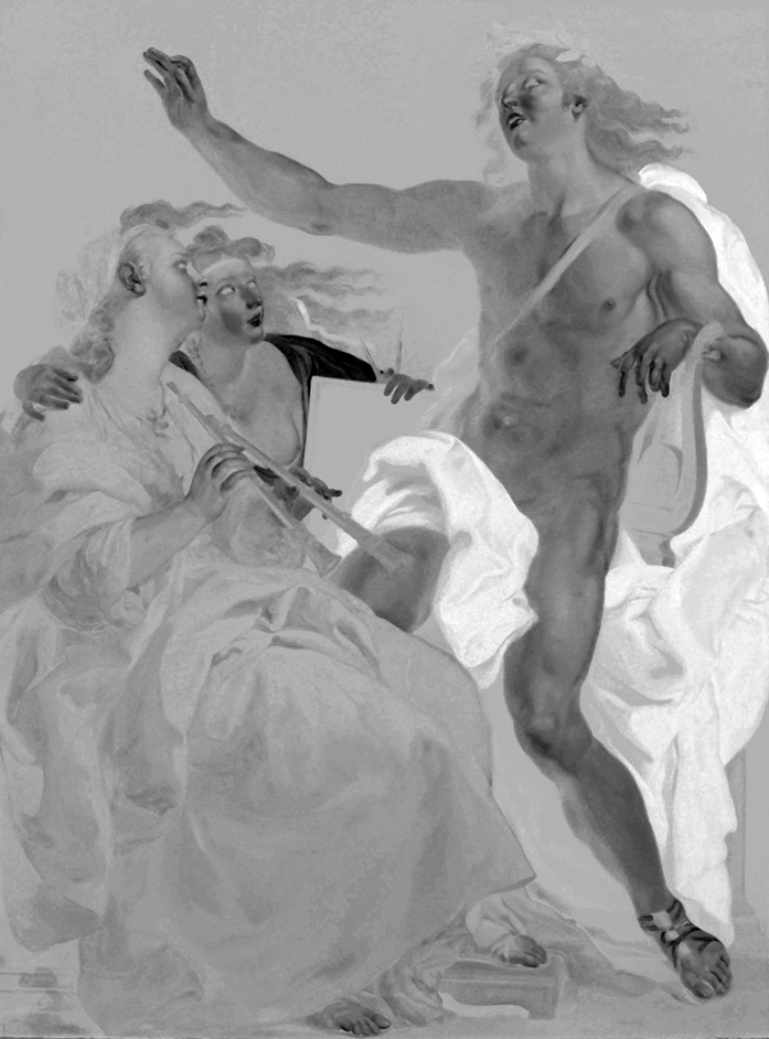
Regardless of the observer’s knowledge, we have no doubt about the characters and objects depicted in the painting. Referring to the classic canons of beauty, we can even say that the painting is impeccable, but it also does not create tensions that held our attention for longer when watching the painting by Monet. And this is not surprising, because the visual system has very little puzzles to solve here. Shapes are coded with both brightness and two color channels (red-green and blue-yellow) and confirm each other almost in 100% (see Fig. 128 C‑D).
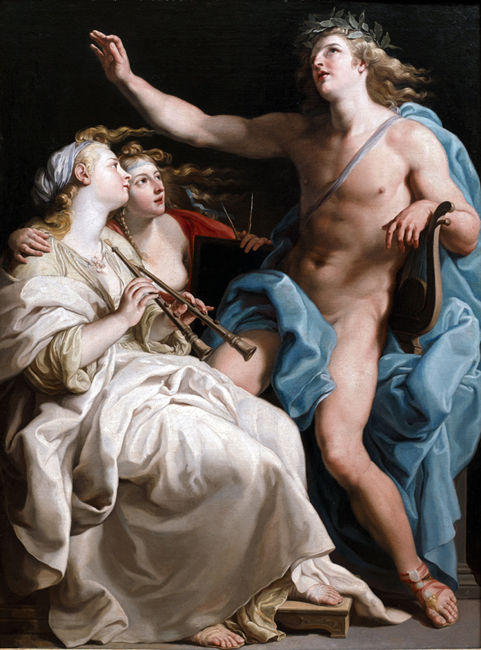
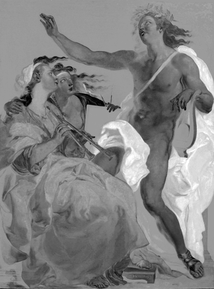
To recognise the scene depicted by Batoni in the picture, it does not really matter which version of it we see. Similarly, all three visual channels encode the shapes of the characters painted on it. This is the most typical way in which the visual system registers and interprets the distribution of light entering the observer’s eye. It is closest to everyday experience. In this way, for centuries, Western European painters have tried to capture reality in paintings. It was not until the invention of photography in the first half of the 19th century that this direction of painting developed decisively. As a result, visual arts freed themselves from too narrow frames of eras and styles and truly exploded with revolutionary changes within the so-called contemporary art.
Painting by Claude Monet, Impression. Sunrise is one of the most important manifestations of this revolution. Monet broke with tradition, showing that the goal of visual art is not to accurately depict reality, but to create it. In fact, each intentionally created painting does not so much reproduce reality, but presents it transformed, just from the fact that the visual scene is kept within its frames. And it is not only about the content of the performance, but above all about its form. In any case, this way of thinking about the painting dominated almost all contemporary art. In this context, I would also like to draw attention to other, extremely interesting painting, which illustrate various types of deviations from the principle of striving for obsessive confirmation of content using all three visual data analysis channels that interest us.
Coloring pages by Picasso
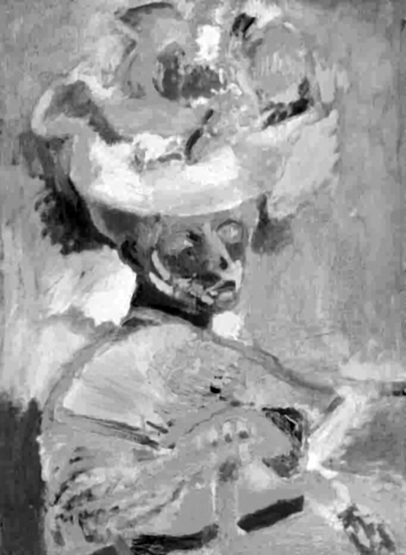
The first example is almost the second end of the compliance scale for shapes encoded by the luminance channel and opponent-color channels. A beautiful painting by Pablo Picasso, Mother, and Child, depicts his first wife, Olga Koklowa, with their one-year-old son Paul (Fig. 129).
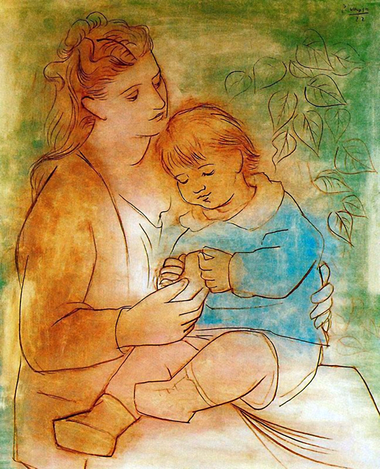
It is an excellent example of the nonchalance with which the artist filled the contours of the drawn figures with colors. The contour and colorful spots blend freely as if they were not connected with each other. The colors merely suggest something: green means the background, blue — Paul’s blouse, and even their absence means that Olga’s dress is simply brighter than the jacket. Just 30 years earlier no one would pay attention to such a painting, it would be considered a sketch for a painting, and not a finished work. And yet this carelessness in the location of colorful spots does not bother you, but on the contrary, it brings the whole scene to life.
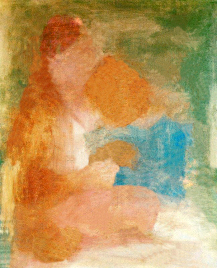
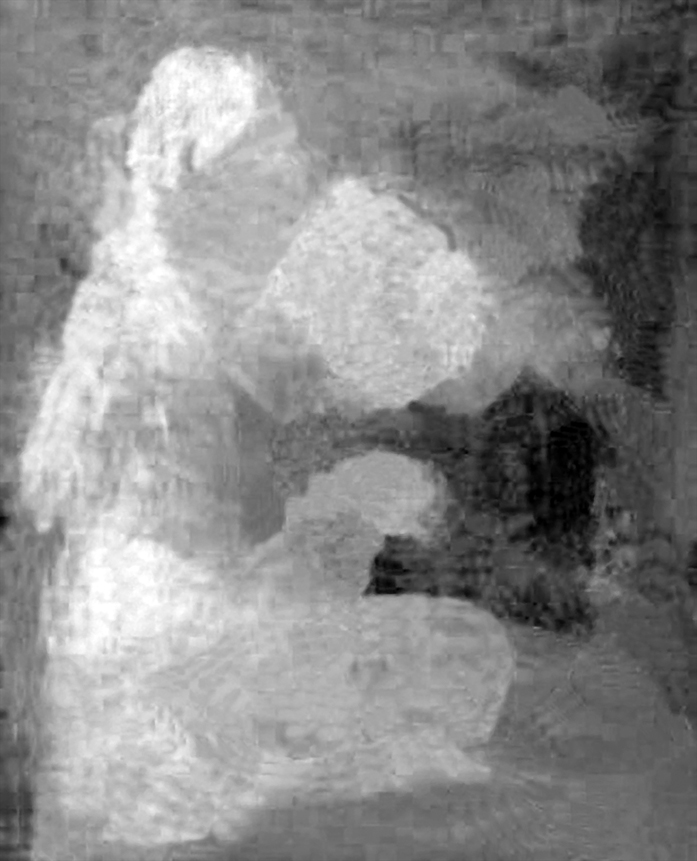
After separating the drawing from the colored spots, we can really see how the contours of the mother and child do not coincide with the edges of the colored surfaces (Fig. 130 A and B). If we had not seen Picasso’s work before, we would probably have hard time guessing what these spots represent. After filtering through opponent-color channels, we can even better see the loss of color-coded shapes (Fig. 130 C and D). Black and white, ambiguous spots resemble projection screen on which the mind of the observer can cast almost any association. It is probably thanks to them that Picasso’s work takes on new meanings and is more interesting.

Henri and Amélie Matisse on the bend of life
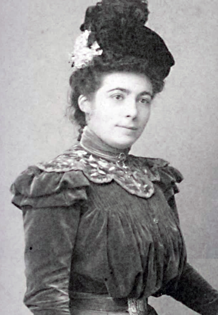
Another example of an outstanding painting that I would like to draw attention to is Woman with a Hat. Henri Matisse exhibited this painting in 1905 at the Salon d’Automne in Paris (Fig. 131 A). It depicts his wife, Amélia Parayre (Fig. 131 B), in a sophisticated hat.
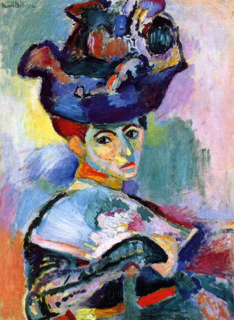
Matisse’s painting, just like Monet’s, caused a lot of confusion in the circles of artists and art experts at the time. Before, no one dared to show a painting created in this way. It was a slap in the face for students and good taste.
But what really annoyed the art critics? What made them call Matisse and his fellow painters “beasts” (fauves) and the Woman with a Hat “an impressive daub”? “Shown at the Paris exhibition, it is still a kind of scandal to this day. It attacks with sharp contrasts and a restless, broken surface. When we finally see Amelia Matisse’s face under an overwhelming extravagant hat, we are struck by the impression of uncertainty and depression” — writes Anna Arno (2012) in an article about Gertrude Stein and her passion for collecting Matisse’s works. But is it just a face full of “uncertainty and depression”?
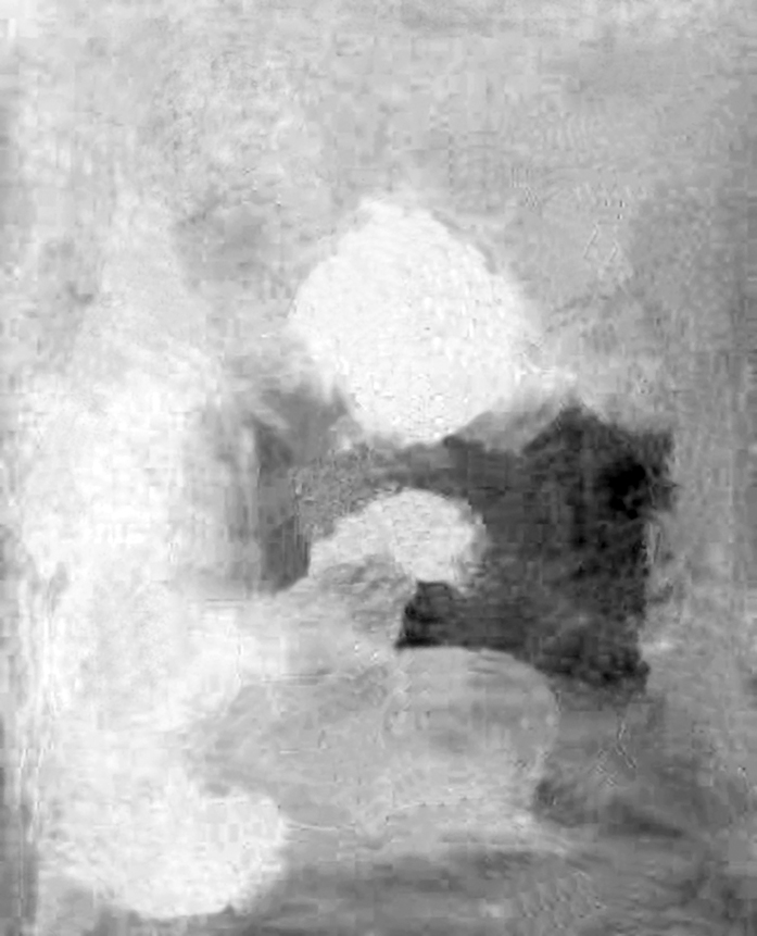
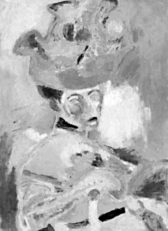
A glance at Amelia’s face under a red hat confirms Arno’s observations regarding the mood of the portrayed model. However, when I balanced the brightness of all the colors in the image, and then filtered out the pair of opposing colors and changed the results of these filtrations to a monochrome form, a shocking image appeared in front of my eyes. Here a ghost skull emerged from under a huge hat, with empty eye sockets and fragments of a rotting body. Breaking the painting into two opponent-color channels revealed a much more dramatic truth about the painted woman than it would appear from a quick look (Fig. 132 A and B).
Were the sharp colors used by Matisse to cover his wife’s face only an extravagance of a painter seeking new forms of expression? Or maybe they were not fully consciously used by him in this way, because of strong negative emotions. There were plenty of reasons, as the beginning of the century was a real nightmare for the Maisse family. Four years after their wedding, they were completely deprived of their livelihood due to the bankruptcy of Amélie’s parents. They left Paris and settled in the countryside. Critics completely rejected the works of the not-so-young painter. Matisse was close to suicide. The last resort was the siblings of American art collectors Gertrud and Leo Stein. They recognised the value of work by Matiss and began to buy his paintings.
The Steins helped not only Matiss and his family, but also another exceptional artist who with great effort broke through the concrete ceiling of art criticism in the early 20th century. He was Pablo Picasso.
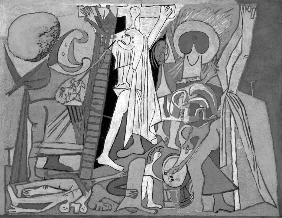
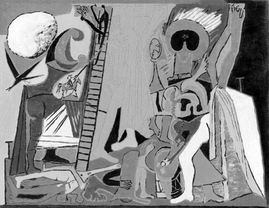
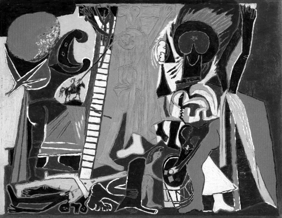
Where is the cross in the Crucifixion scene?
In concluding this chapter, I would like to recall one more example of a painting illustrating the divergence of forms coded with opposing colors and luminance. It is about the Crucifixion, a picture painted by Pablo Picasso in 1930 (Fig. 133 A). Picasso painted almost all the characters and objects on it with sharp colors. Only the centrally located scene of the title crucifixion is white. The contour of the cross and the distorted silhouettes of Christ and most likely Mary on a white background provokes to fill it with color, as in a children’s coloring book or stained glass.
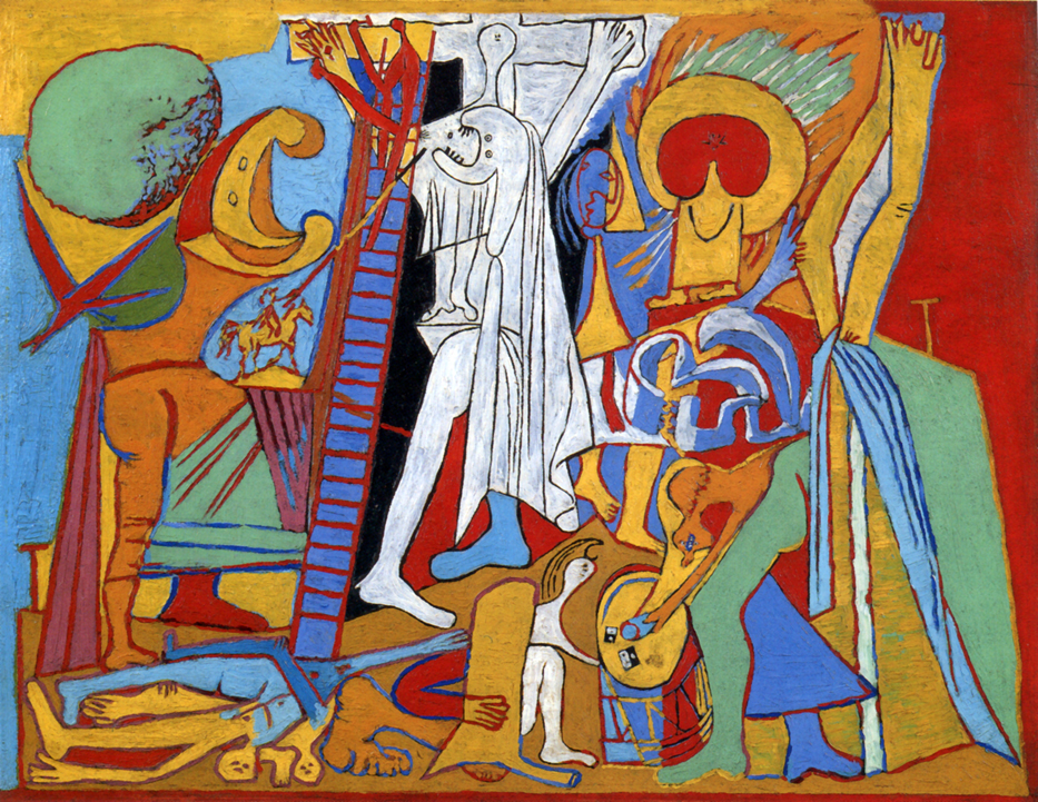
The monochrome version of the painting, like the Woman with a Hat by Henri Matisse, reflects the location of all objects, characters and parts of them in the scene, just as in the colored version (Fig. 133 B). From this point of view, it can be concluded that bright colors are only an extravagance of a painter who contests the classical standards of figurative painting. Only seeing this work through the lens of a red-green filter (Fig. 133 C) and yellow-blue filter (Fig. 133 D) reveals a surprising regularity. In both versions the central scene of the crucifixion disappears. We can see a kind of curtain or just an empty surface. This is the opposite situation to the effect obtained by Claudie Monet in Impression. While there, the brightness of the sun was very similar to the brightness of the grey-blue background, and only the colors signalled its presence in the painting, in the work of Picasso, contrasts of brightness allow to easily identify the central scene, but not the color.