VISUAL ACUITY
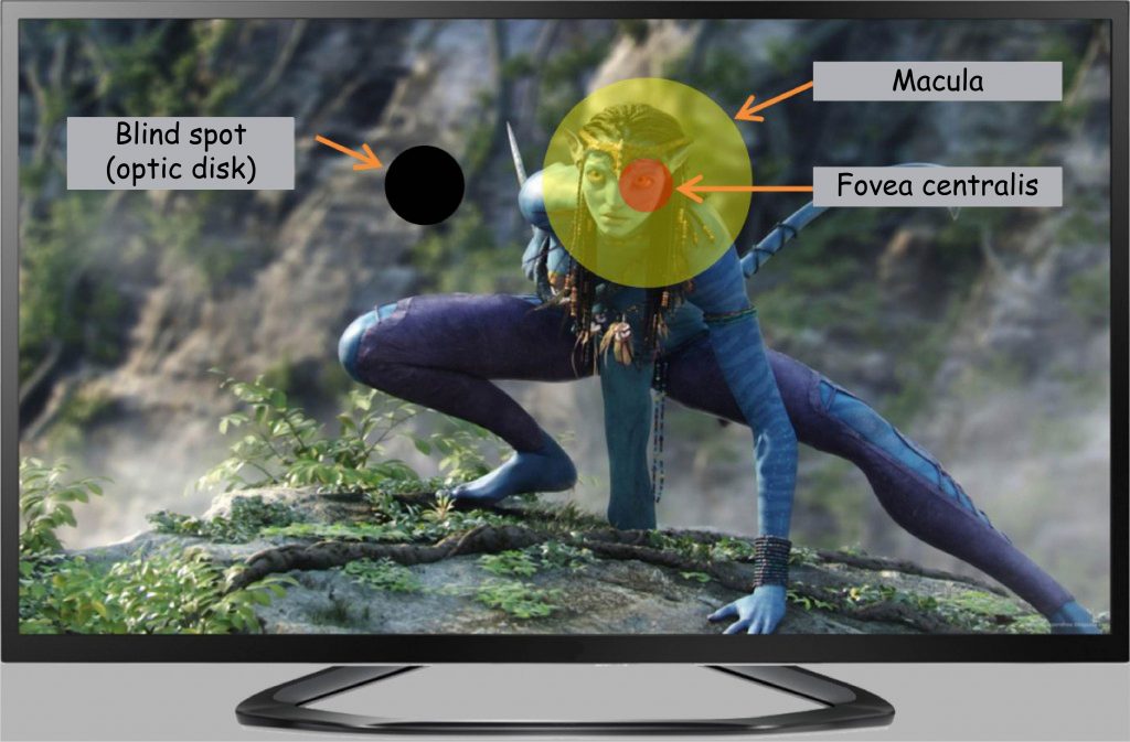
The range of vision by fovea
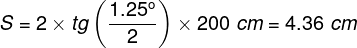
What is the significance of the uneven distribution of cones on the surface of the retina described in the previous chapters, i.e., the fact that in its central part, especially in the macula, there is the largest number of them, and on the periphery — not too many? To answer this question, it is necessary to remember, first of all, that the fovea covers only 1.25° of the field of vision angle (maximum 2°), and the whole macula — no more than 5.5° (Hendrickson, 2009; Duchowski, 2007). This means that fovea covers the area no more extensive than that of the thumbnail at a distance of the extended hand, as can be seen by applying one of the formulas from the previous chapter (Henderson and Hollingworth, 1999):
It can be pictured differently, as well. Suppose that we are watching a film on a 40″ LCD TV with a screen area of 5,814 cm2 from a distance of 2 meters:

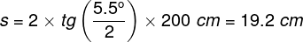
where h is the height, and w is the width of the rectangular image. The image displayed on the screen is projected over the whole retina, but only a small part of the image, equal to a circle of approximately 19 cm in diameter, falls on the macula:
Knowing the diameter of a circle we can easily calculate its surface area:
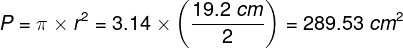
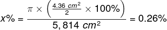
which approximately corresponds to 5%, i.e., 1/20 of the total screen surface area:

An even smaller part of the screen is projected onto the fovea, equal to a circle with a diameter of approx. 4.4 cm:
which corresponds to only 0.3% of the total TV screen surface area:
To sum up this arithmetic, at every point of visual fixation on the TV screen, the brain is well informed about what is currently present only on a tiny part of it (Fig. 55). The remaining portion of the screen is viewed with incomparably lesser clarity. It will be easy to learn about it when other properties of the retina are analyzed.
Photoreceptors and ganglion cell receptive field
The Polish word “siatkówka,” like its English equivalent “retina,” derives from the word “network” (in Latin, rete means “network”). The retina is a complex, five-layer structure made up of neurons lining the bottom of the eye. In most areas, apart from layers of cones and rods, there are four other layers of cells in the retina: horizontal cells, bipolar cells, amacrine cells, and ganglion cells.
Each cell layer has its specific functions. Some of these functions are well recognized and described, while others remain unknown. Generally speaking, cones and rods react to light entering the eye; bipolar, horizontal, and amacrine cells are involved in the initial development of data on stimulation of photoreceptors, while ganglion cells send the results of this development to the brain (Dowling, 2009).
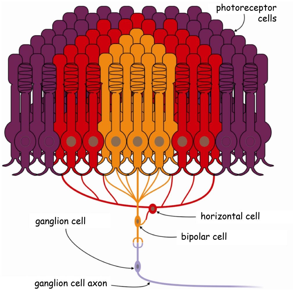
The first stage of visual data processing takes place already in the retina of the eye. Even though there are approx. 100 million photoreceptors on its surface, the information on their activity is transmitted to the brain by only 1 million ganglion cells (Wróbel, 2010). It means that the brain, more precisely, the cerebral cortex, does not receive data on the condition of each photoreceptor. On the contrary, the vast majority of photosensitive cells are connected in smaller or larger groups by horizontal, bipolar, and amacrine cells. The group of such joined photoreceptors is, in turn, combined with the ganglion cell, creating the so-called receptive field of the ganglion cell.
Since all photoreceptors are more than 100 million and ganglion cells are around 1 million, it is not difficult to calculate that, on average, one ganglion cell is per 100 photoreceptors. However, the number of cones and rods per square millimeter of retina depends on their distance from the fovea. Similarly, the number of them varies from individual receptive fields depending on whether they are closer to or farther from the fovea. This means that the further away from the center of the retina, the larger the receptive fields of the individual ganglion cells are. Above the field of vision angle of 20o, the size of the receptive fields is about the same. They generally cover a surface area for the retina constituting approx. 1 mm2 and connect several hundred photoreceptors (Młodkowski, 1998).
The smallest receptive areas of individual ganglion cells are located in the macular area and include the range of a few to several cones. In the fovea itself, the receptive areas are only composed of individual cones. There are no horizontal and amacrine cells in this area, and information from the photoreceptor is transmitted directly to the ganglion cell through the bipolar cell. This is the place from which the information about the image projected on the surface of the retina is transmitted to the brain with the accuracy of one cone diameter, i.e., three μm! (= 0.003 millimetre) (Hendrickson, 2009).
Visual acuity by fovea and periphery of the retina
A direct consequence of the various size of the receptive fields depending on their location on the retina is a decrease in the vision accuracy in the peripheral part, where only large receptive fields dominate. Worse vision accuracy is expressed as a decrease in the sensitivity of the retina to the differentiation for details of the image projected into the area built up from large receptive fields. A single signal flows to the ganglion cell from each receptive field, which averages the activity of all cones and / or rods that compose this field. The larger the retinal surface from which the signal is averaged, the easier it is to lose detail. The process of averaging the signal can be compared to “bundling” of visual data into smaller, more synthetic forms (Troy, 2009).
It is worth mentioning that large receptive fields are located in this retinal area, where the number of cones is stabilised at a minimum level and the number of rods is gradually decreasing. A relatively small number of photoreceptors (which are connected to each other in large receptive fields) in the peripheral area (i.e. above 10o field of visions angle in good lighting conditions and above 20o – after dark) causes that the accuracy with which the brain is informed about the image projected onto it is relatively low in a significant area of the retina (Fig. 56).
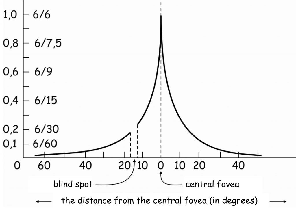
In order to understand the graph in Fig. 56 it is necessary to remind us a bit of the history of research on visual acuity. The estimation of visual acuity is based on a method developed by Danish ophthalmologist – Hermann Snellen – in the mid-19th century. He proposed that visual acuity should be defined as the ratio of the distance, from which the examined person looks at the so-called optotype, to the distance from which it should be correctly recognised (Nizankowska, 2000). An optimotype is, for example, a black letter E on a white background, seen from such a distance that its elements are differentiated at an angle of 1′ (1/60 of an angular degree; Fig. 57).
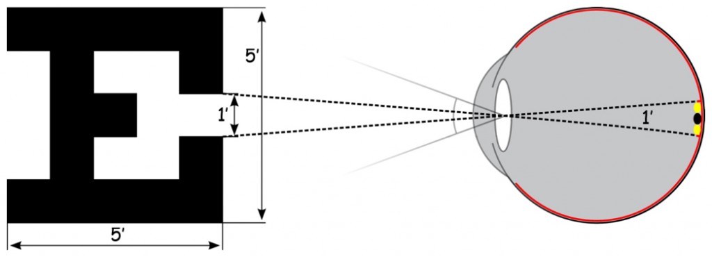
The concept is simple. The aim is to check whether the visual system of the examined person is able to differentiate two points on the optotype (e.g. the distance among the serifs in letter E; Fig. 57). This is equivalent to stimulation of two cones in the fovea, between which there is one unstimulated cone. It is known that the diameter of one cone is approx. 0.003–0.004 mm (i.e. approx. 3–4 µm). Taking into account the distance of the cones from the centre of the optical system of the eye in the lens, it is possible to calculate the angle at which light would have to fall into the interior of the eyeball, in order to illuminate these two extreme cones. This angle is precisely 1′.
In order to standardise the examination of visual acuity, Snellen developed a chart, commonly known from ophthalmologist’s offices, containing letters of various heights, arranged in 11 rows (Fig. 58, left side). A record of two numbers, e.g. 20/200, next to one of blocks of letter rows, means the ratio of two distances: the distance from which the measurement of visual acuity is made (i.e., 20 feet, ca. 6 metres), to the distance from which the letter in a given row should be correctly recognised with healthy eyes (i.e., 200 feet, ca. 60 metres). In other words, if you have normal eyesight, you should recognise the letter E in a first row from a distance of 60 metres.
The chart in Fig. 56 shows that the maximum visual acuity using a fully functioning eye is 1.0. Only one small retinal area, i.e. the fovea (marked with a vertical dotted line at point 0) has such efficiency. A visual acuity of 1.0 corresponds to the ability to recognise letters correctly in the eighth row (highlighted in red) of the Snellen chart at a distance of 20 feet (20/20 feet = 6/6 meters).
Let us suppose that the smallest letters that the examined person correctly recognises at a distance of 20 feet (6 metres) are the letters C and J in the second row of the Snellen chart (Fig. 58). They should be correctly recognised from a distance of 100 feet (approx. 30 metres). This means that the level of blurred vision of this person is 0.2 (20/100 = 0.2) and (s)he definitely requires glasses to correct this visual impairment. When we look at this Fig. 56 again, you will notice that a visual acuity index, equal to (or less than) 0.2, corresponds to the visual acuity of the image projected on the retina above 15o, i.e. its area lying far beyond the macula.
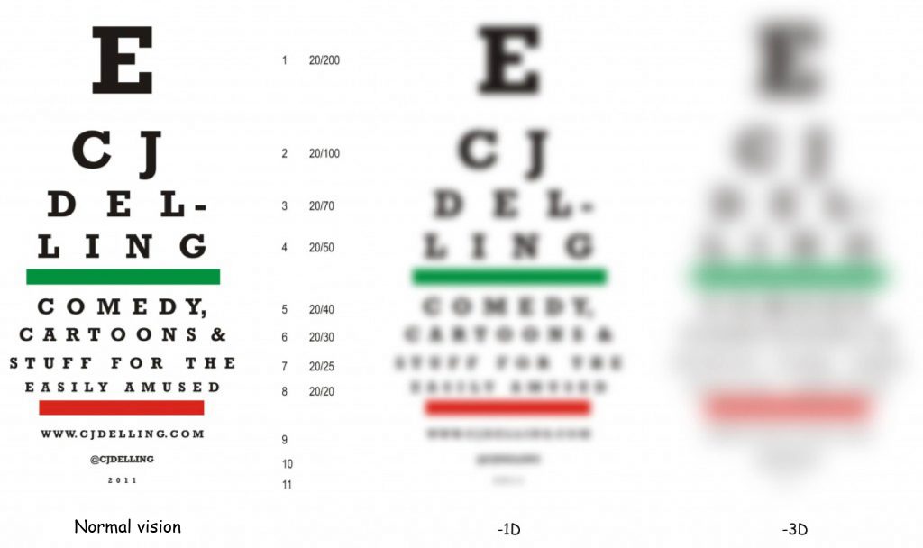
To realize how blurred this image is, it is enough to look again at Fig. 58. Two pictures are shown on the right side, illustrating how Snellen charts are most likely to be viewed by short-sighted people who require vision correction between ‑1 and ‑3 dioptres. There is no simple conversion of the Snellen’s visual acuity index into dioptres, but it can certainly be said that the Snellen index equal to (or less than) 0.2 corresponds to the sharp image more or less similar to the one seen by a short-sighted person with a refraction defect of ‑3 dioptres.
In other words, if we assume that the maximum (or equal to 1.0) visual acuity is associated with the fovea, it constitutes only 20% above the 15o angle of view, which means that it is five times smaller and even smaller with each successive degree (angle).
The world’s most famous smile
Varied resolution of image encoding in different parts of the retina can significantly affect the sense of the image. Margaret Livingstone (2000), a neuroscientist influenced by Ernst Gombrich’s suggestion (2005), noticed that viewing Leonardo da Vinci’s Mona Lisa she had the impression that Mona Lisa smiled at her differently, depending on which part of the painting she focused her eyes on. The key factor is the distance between the viewed fragment and the lips of the Leonard’s model. The further this fragment is located from her mouth (e.g. background or hands), the more her smile becomes cheerful. According to Livingstone, the answer lies in the difference between a blurred (out-of-focus) image and a sharp one. The further away our gaze is from Mona Lisa’s mouth, the smoother, fuller and more sensual it becomes.
Using a computer graphics program, Livingstone reproduced the image of the Mona Lisa’s face, when it was clearly seen with cones in the fovea and when her image was projected onto two different peripheral parts of the retina. Technically, Livingstone first blurred the image with a Gaussian blur and then raised the contrast of the processed image, thus simulating the loss of resolution that is typical of peripheral vision. I have repeated this procedure; its effects can be seen in the Fig. 59.
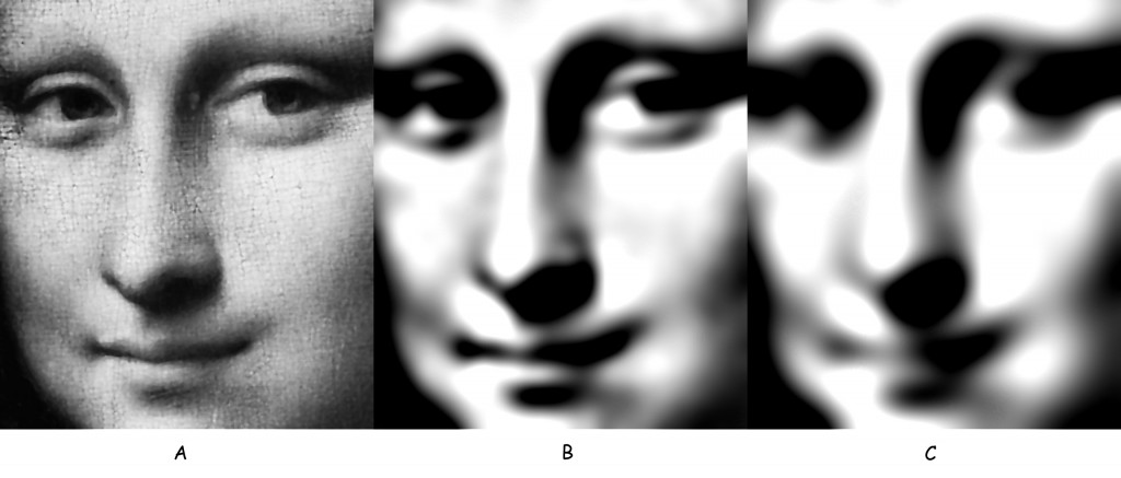
By juxtaposing the effects of these treatments, it turned out indeed, that the less clear Mona Lisa’s face is, the more cheerful her smile is. In other words, while the content of a centrally recorded painting is a lady with a slightly reflective facial expression, the content of the same painting, but recorded peripherally, is a girl who smiles cheerfully and more sensually at the person looking at her.
Livingstone (2000) suggested that her hypothesis explaining the mysterious smile of Mona Lisa depending on the distance of the viewed fragment of the painting from her mouth is at least as likely as a reference to Leonardo da Vinci’s technique of softening the edges of painted objects and their parts (sfumato). I will return to this technique later in this book as it enables us to better understand the role, which the contours of the seen objects play in their interpretation.
On central and peripheral vision in painting and photography
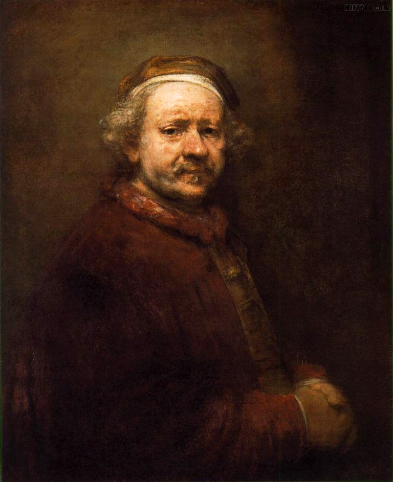
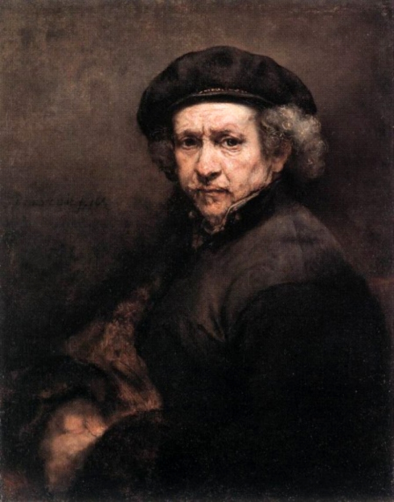
In reference to the majority of paintings and photographs, one can say that almost their whole surface is filled with equally clear objects. Exceptions include – and not always – e.g. distant plans in the landscape, unspecified background or effects obtained by reducing the depth of field. However, there are also examples of paintings whose composition is emphasised by the sharpness of some fragments and the almost complete lack of sharpness of others. When we look at some of Rembrandt’s self-portraits, we will discover that only the artist’s face has been painted with great attention to detail while the presence of other fragments is merely signalled (e.g. hands) (Fig. 60 and Fig. 61).
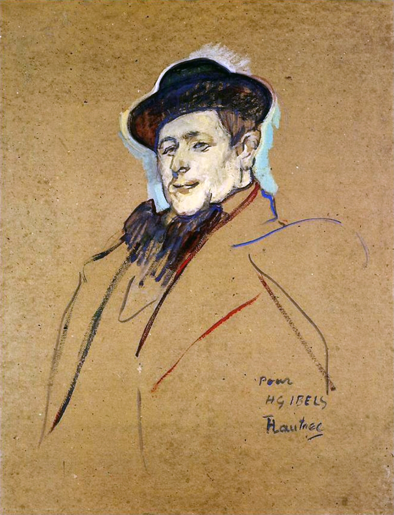
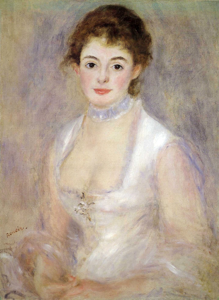
Similar effects can be seen in some works by Henri de Toulouse-Lautrec and August Renoir (Fig. 62 and Fig. 63), as well as many other artists.
An expressive face, in comparison to other parts of the painting, is undoubtedly a factor that attracts attention of an observer, but also almost magnetically forces him/her to focus attention on that detail only. These paintings perfectly illustrate the intuition of artists who use a mechanism of central and peripheral vision. Assuming that these paintings are being observed in the museum from a distance of about 1.5 m and that the macula covers a maximum of 5.5o of the field of vision angle, it turns out that the artists perfectly reconstructed the relation between the image surface being captured centrally and the one being peripherally recorded.
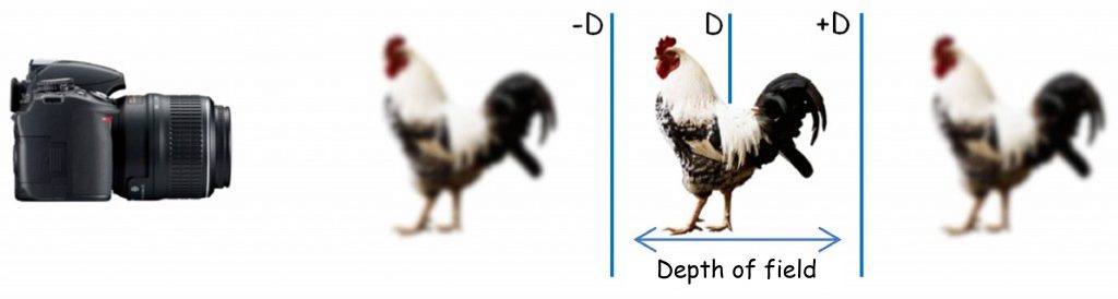
The effects in the presented paintings can also be achieved with the use of a photographic method, through the manipulation of the depth of field (Fig. 64).

The depth of field is the distance between two viewing planes located in front of and behind the plane of field of view D, on which the optical system of the camera or the eye is set (Fig. 65). All images projected on planes lying between ‑D and +D shall be recorded with almost the same sharpness as the image in plane D. The depth of field does not depend on the accommodation of lens, but on the size of the aperture or the pupil. The smaller the depth of field, the longer it is, i.e. it enables to clearly record more elements lying on the far-reaching dimension. This effect is much easier to achieve and use in photography than in painting.
At the end of this chapter, I would like to mention one more example of a painter whose surrealistic paintings are filled with objects and spaces programmatically presented with different sharpness (Fig. 66 A). Chris Berens – a modern Dutch painter fascinated by the works of: Frans Hals, Jan Vermeer and Rembrandt Harmenszoon van Rijn – has developed an original painting technique. Unlike his masters, he paints with drawing ink on paper. He states that their properties are similar to oil paints, but simultaneously enable to obtain completely new visual effects. Indeed, looking at his paintings we can get the impression that something bad is happening to our eyes. It seems as if the optical system of the camera had not one, but many depths of field at the same time.
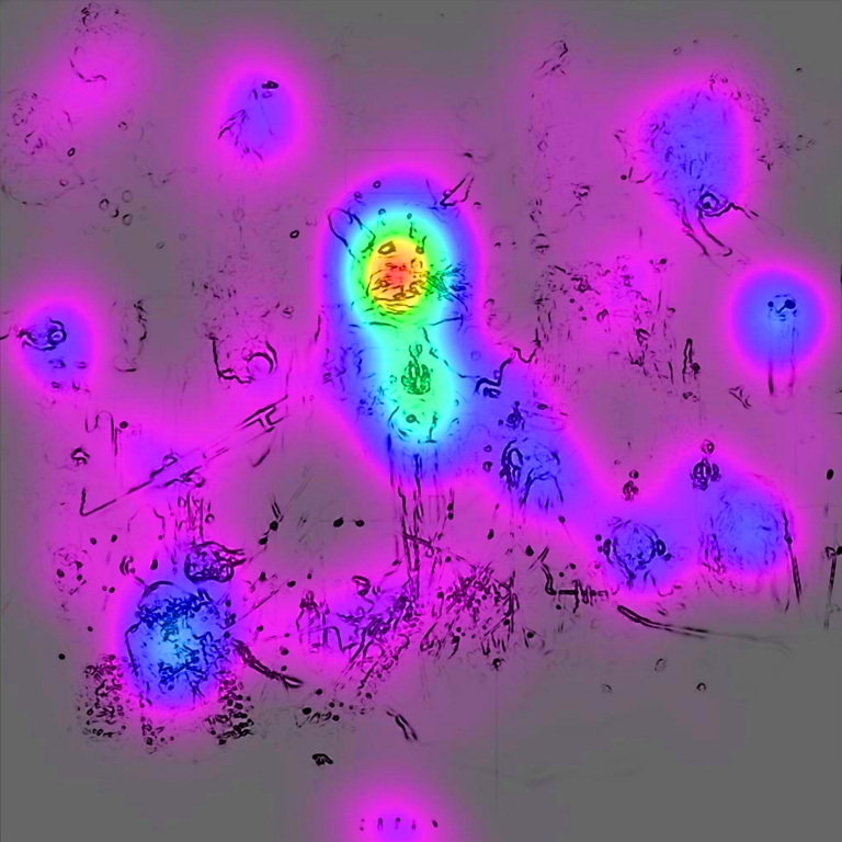
Together with Agata Królikowska we showed between ten and twenty paintings created by Chris Berens to more than fifty people examined. When they were viewing the paintings, we recorded the movement of eyeballs of the examined persons using the SMI iView X Hi Speed 1250 Hz oculograph. The results of the study in relation to the painting in Fig. 66 A are shown graphically in Fig. 66 B.
The painting in Fig. 66 B is composed of 2 superimposed paintings. The first painting shows only black irregular lines. This is the result of graphical analysis, the purpose of which was to determine the edges lying at the junction of the most contrasting points in Fig. 66 A; in other words, those with the greatest sharpness. There are no edge marks in the painting in fuzzy or blurred areas.
The second picture is an attention map, i.e. a graphically presented record of the eye movements of the examined persons. Colored spots indicate how often the examined persons looked at different parts of a given painting and how long they maintained their gaze on them. The red color is an indicator of the greatest attention devoted to a given fragment of the painting; successively: yellow, green, light blue, dark blue and lilac. Places devoid of color are those which were practically unnoticed by the examined persons. Both techniques of graphic analysis of paintings and oculomotor data are presented in more detail in the next chapter.
In this chapter, it is enough to note that there is a close relationship between the location of black edges and the visual attention given to a specified fragment of a painting. The clearer the fragment is, the more willing we are to look at it. This is not always the case, but we certainly start viewing each visual scene from those places that enable us to read its meaning accurately.
To sum up, with reference to all illustrations presented in this chapter, one can pose a question as to what causes that some of their parts we see clearly and others we do not. The loss of clearness of a given fragment of a painting or a photograph is associated primarily with a decrease in the sharpness of the contours of painted or photographed objects and their parts. In other words, we see vaguely because the boundaries, lying at the point of contact of two planes differing in brightness, are tonally interpenetrated, blurred and do not enable to determine where one plane ends and the other begins. Seeing contours not only allows us to see an object, but also to distinguish it from other objects present in the visual scene. Distinguishing objects and their parts on the basis of shapes determined by their contours is a basic function of the sight (Marr, 1982; Ratliff, 1971). I will deal with this issue in the next chapter.
CONTOURS OF THE THINGS YOU SEE
What happens at the borders is the only information you need to know: the interior is boring (Hubel, 1988)
Image and contour luminance
If we examine a photograph through a magnifying glass, in general we would not be able to see many contour lines, namely lines which, by circling the fragments of the visual scene lying next to each other, mark the shapes of objects and their parts depicted in the scene. In Fig. 67 there is the left eye’s corner of the clearly photographed girl from the background of the previous chapter, enlarged 32 times. It is difficult to find the contour lines here, nevertheless looking at a small photo on the left side in Fig. 67 there is no doubt where clearly outlined edges of the eyes, lips or hair of the photographed girl are located, where her face ends and the background begins. This is largely determined by the width of the tonal band which separates differently illuminated planes of painted or photographed objects and their parts from each other and by the size of the difference in brightness (luminance) of these planes. The narrower the tonal band separating two planes is and the greater the difference in these planes brightness is, the easier identification of their borderlines, i.e. the contour would be. But how does the visual system set this limit?

According to David Marr and Ellen C. Hildreth (1980), the creators of one of the mathematical algorithms that simulate the process of edge detection by the human eye, contours of things are a manifestation of the so-called discontinuity of luminance. Continuous luminance is typical of planes whose lightning changes gradually over relatively large space. On the other hand, the smaller the space in which the surface illumination changes, the higher possibility of edge identification. Currently, majority of computer software for image processing has built-in edge detection algorithms. From the point of view of edge detection issues in question, it is worth looking more closely at their operation mode.
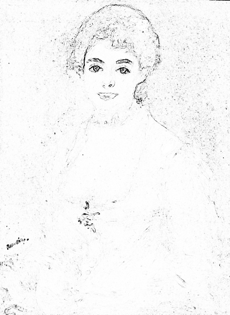
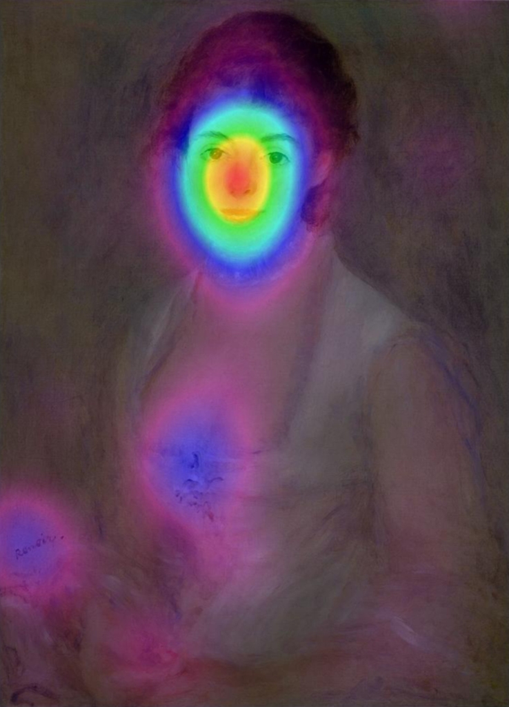
After isolating the luminance channel from the colorful reproduction of the painting of Madame Henriot created by Pierre-Auguste Renoir, we will see the image in full grayscale, from white to black (Fig. 68 A). If we analyse the painting in order to identify the borderlines between the planes with greatest differentiation in terms of brightness, we will see the outline of the model’s face contours and clothing, which in the original picture are perceived as most clear (Fig. 68 B). In other words, we have an impression that some part of the painting is sharp, because we see the contours in it. The lips, nose, hair outline and, especially, the eyes of Madame Henriot are clearly highlighted by the contour lines. In turn, other parts of her body and clothing, which are below the face, are blurred because it is impossible to distinguish sensible shapes based on the few fragments of contour lines created as a result of edge analysis. However, there are two exceptions. One is approximately in the middle of Madame’s neckline and, as we suspect, it is an outline of jewellery. The second, a little to the left, is Renoir’s signature.
According to David Marr and Ellen C. Hildreth (1980), the creators of a mathematical algorithm that simulate the process of edge detection by the human eye, contours of things are a manifestation of the so-called discontinuity of luminance. Continuous luminance is typical of planes lightning of which changes gradually over relatively large space. On the other hand, the more possible edge identification, the smaller the space in which the surface illumination changes. Currently, majority of computer software for image processing have built-in edge detection algorithms. From the point of view of the edge detection issues in question, it is worth looking more closely at their operation mode.
After isolating the luminance channel from the colorful reproduction of the painting of Madame Henriot created by Pierre-Auguste Renoir, we will see the image in full grayscale, from white to black (Fig. 68 A). If we analyse the painting in order to identify the borderlines between the planes with greatest differentiation in terms of brightness, we will see the outline of the model’s face contours and clothing, which in the original picture are perceived as most clear (Fig. 68 B). In other words, we have an impression that some part of the painting is sharp, because we see the contours in it. The lips, nose, hair outline and, especially, eyes of Madame Henriot are clearly highlighted by the contour lines. In turn, other parts of her body and clothing, which are below the face, are blurred because it is impossible to distinguish sensible shapes based on the few fragments of contour lines created as a result of edge analysis. However, there are two exceptions. One is approximately in the middle of Madame’s neckline and, as we suspect, is an outline of jewellery. The second, a little to the left, is Renoir’s signature.
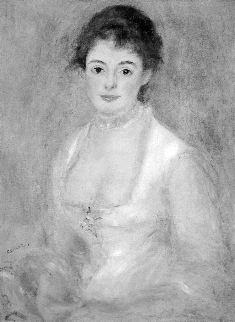
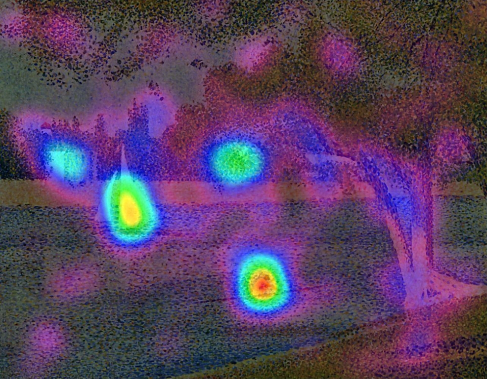
To prove that the eyes of the observer are particularly focused on searching for the most contrasting places in the visual scene, as their analysis gives the greatest chance to recognise the contours of the objects located in it, it is worth noting the result of an oculomotor examination, which we conducted in our laboratory with Anna Szpak on a group of 38 students (19 women and 19 men aged around 22 years) The task of the examined persons was to watch reproduction of a dozen or so paintings, on a 23″ Apple Cinema HD Display (1920 x 1200 pixels) monitor. There is the painting created by Renoir among these paintings. The examined persons were not limited by time, but we recorded their eyeballs movement, using SMI iView X Hi Speed 1250 Hz oculograph all the time. The results of this study, presented in the form of a visual attention map, are presented in Fig. 69.
Comparing the records in Fig. 68 A and in Fig. 69, it is easy to see that the greatest interest of the examined persons was generated by the face and the above mentioned two elements distinguished by a higher contrast, i.e. brooch in the neckline of the dress and signature of the artist. It is worth mentioning that a colorful attention map in Fig. 69 includes averaged information about both the number of points which temporary fixate the sight on a given fragment of a painting, and the time of these fixations, for all persons examined in total.
Since the areas with increased contrast between the planes lying next to each other generated much more interest than other areas in the painting, it is worth answering the question which neurophysiological mechanism is responsible for this effect.
Ernst Mach’s Bands
In 1865, the Austrian physicist, philosopher and psychologist – Ernst Mach – published an article in which he proposed a concept to explain the visual illusion, characterised by additional thin (but distinct) bands (lighter on the side of a lighter plane and darker on the side of a darker plane) that can be seen along the edges of planes with different brightness, lying next to each other (Fig. 70 A).


Looking closer at a uniformly white surface of the rectangle (Fig. 70 A) for a while, we can notice a narrow, slightly lighter line located just in front of the edge of the grey rectangle. It seems that this line is even whiter than whiteness of the whole rectangle. In fact, there is no lighter line there, as evidenced by the analysis of the picture in a digital photo editing program. A similar effect can also be observed on the black side of the first rectangle on the left, although it is slightly more difficult to see it. Paradoxically, despite the 100% blackness of the plane, the vertical band seems to be even “blacker”. In order to see it, it is enough to focus your gaze longer at the place where the black plane begins to lighten and the line will be fully visible. The visual illusion in question is known as Mach bands. For comparison, when the transition between black and white is constant, as shown in Fig. 70 B, then you cannot see the additional bands separating dark fragments of the plane from the light ones.
One of the most eminent experts on the concept by Ernst Mach was Floyd Ratliff (1919–1999), a psychophysiologist and biophysicist, who for many years conducted studies on optical illusions, especially those related to the contrast of color and lightness. He was also a fan of Neo-impressionists’ works, interia alia on the grounds that they were fascinated by the presentation of the phenomenality of the world in a way as it appears in the subjective acts of visual perception (Ratliff, 1992).
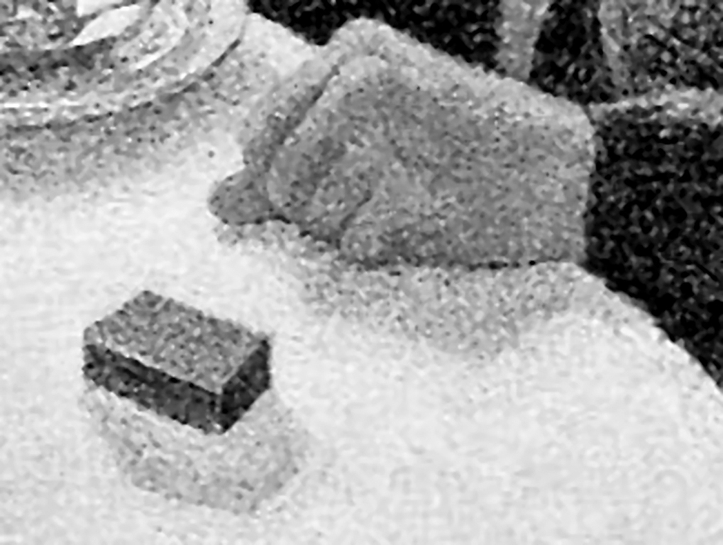
Analysing the painting The dining room, created by Paul Signac, Ratliff (1971), he noticed that the artist — consciously or unconsciously — painted some objects taking into account the illusion of Mach bands (Fig. 71 A).

A few shadows are cast on the table surface by a book, a salad bowl, a carafe, a plate, a box and a hand (Fig. 71 B). At the edge contact point between a darker object and a slightly lighter shadow, Signac slightly lightened the shadow to emphasise the contrast between it and the object that casts it. A person viewing a painting has no doubts what shape a given object has been painted, because the shadow is additionally separated from the object with a lighter band. It is an excellent illustration of Mach bands, painted in the way the brain “sees” them.
The painting Bathers at Asnières by Georges Seurat is another example of the artist’s clarification of the contact point of two planes with similar lighting (Fig. 72). In the places marked with arrows, the painter darkened (black arrows) or lightened (white arrows) the background to emphasize the separation of the figure from the background. What is interesting, although it constitutes a significant interference in the way the relatively uniform water background is painted, without paying attention to this detail it is almost unnoticeable.

History of art provides many examples of paintings from different cultures, epochs and styles in case of which the authors intuitively used Mach’s illusion to highlight the contrast between objects depicted in the visual scene. Those interested in various examples of such works can see publications of Michael F. Marmor and James G. Ravin (1997; 2009), Piotr Przybysz and Piotr Markiewicz (2010), Floyd Ratliff (1992) and Robert L. Solso (1996). Chinese painters from several thousand years ago, Renaissance masters and modern painters alike used this technique in their works with equal success.
Are Mach bands just an interesting optical illusion?
Not at all. It turns out that they are a manifestation of the activity of one of the most important visual mechanisms aimed at identification of the contours of the things viewed, by increasing the contrast between adjacent planes with different brightness levels. This makes it easier to distinguish the components in one object and separate them from each other. In particular, this mechanism is useful for those parts of the picture, which are projected onto peripheral parts of the retina, located far from the fovea.
Once again about the structure of the retina: ON and OFF channels
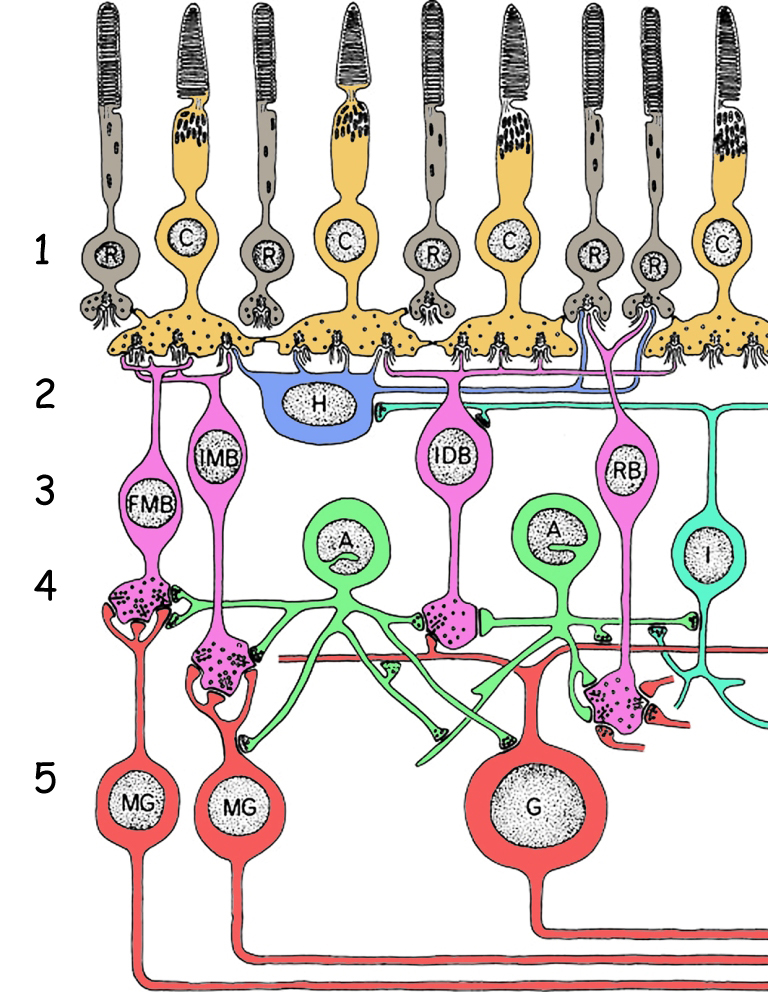
In order to understand how the mechanism responsible for strengthening the contours of the objects seen works, one needs to go deep into the retina and look closer at its complex structure (Dacey, 2000). As indicated earlier, it consists of five layers of cells: (1) photosensitive rods and cones, (2) horizontal cells, (3) bipolar cells, (4) amacrine cells and (5) ganglion cells (Fig. 73). Photosensitive cells, that is photoreceptors (layer 1), react to light entering the eye. Horizontal cells (layer 2) and amacrine cells (layer 4) connect the photoreceptors in the receptive fields and have a direct or indirect effect on bipolar cell activity (layer 3). These, in turn, transmit signals both from photoreceptors and from receptive fields to ganglion cells (layer 5). Finally, the ganglion cells transmit electrical signals deep into the brain via their long axons.
As you can see, the cerebral cortex is informed about the distribution of light in the visual scene not only by the stimulation of the photoreceptors themselves, but also by the activity of the cells connected to them, composing the entire retina.
The horizontal cells are located just below the photoreceptors and they are connected to them through a network of projections, called dendrites (Fig. 74). Photoreceptors interconnected by means of one horizontal cell create its receptive field. One such a cell can be interconnected by several to several dozen photoreceptors.

In turn, each photoreceptor can connect not only to one, but at least to two horizontal cells. Such an arrangement of connections between photosensitive and horizontal cells results in the formation of large groups of photoreceptors in the retina. Each such group, in connection with a single ganglion cell through bipolar cell, creates receptive field of this ganglion cell.
It is worth noting that data on the state of stimulation of particular photoreceptors in the retina of the eye — except for a small area of the fovea — are not transmitted to the cerebral cortex. On the contrary, information at the exit of the retina is lower by at least two orders of magnitude than information entering the retina.
The part of photoreceptors located in the central part of the receptive field of the ganglion cell is connected not only to the horizontal cell but also directly to the bipolar cell. This is particularly important, as information on the state of stimulation of photoreceptors forming the whole receptive field is transmitted to ganglion cell only through the bipolar cells. This network of connections is best seen on the cross-section of the ganglion cell receptive field (Fig. 75). Photoreceptors in the central area of the horizontal cell’s receptive field are additionally connected by dendrites of the bipolar cell.
To sum up, receptive fields of the ganglion cell created by a network of interrelated horizontal cells can be divided into two areas: central area, in which the photoreceptors are operated by both the horizontal and bipolar cells, and the peripheral area, the so called areola, in which the photoreceptors are interlinked only by means of the horizontal cell. Information on brightness of the image projected onto the receptive field depends on the number of photoreceptors stimulated in the central area and in the peripheral area, as well as on light intensity (Matthews, 2000). It also depends on certain specific properties of bipolar and ganglion cells.
There are indeed two types of bipolar cells in the retina of the eye: ON and OFF cells. Each type of bipolar cell is associated with the corresponding ganglion cell, also of ON and OFF types. Combination: photoreceptor (or photoreceptors) → ON bipolar cell → ON ganglion cell is called the ON channel, while combination: photoreceptor (or photoreceptors) → OFF bipolar cell → OFF ganglion cell is called the OFF channel (Longstaff, 2002).
If the light of a higher intensity than average illumination in a given area of the retina falls on a photoreceptor (or photoreceptors) connected directly to ON channel, i.e. to the middle of the receptive field, the ganglion cell would interpret this signal as an information about the stimulation with light of this photoreceptor or group of photoreceptors. The higher number of stimulated photoreceptors in the middle of the receptive field and the less number located in the periphery of the receptive field — the stronger reaction of the ganglion cell (Fig. 76, line (a), column: ON).
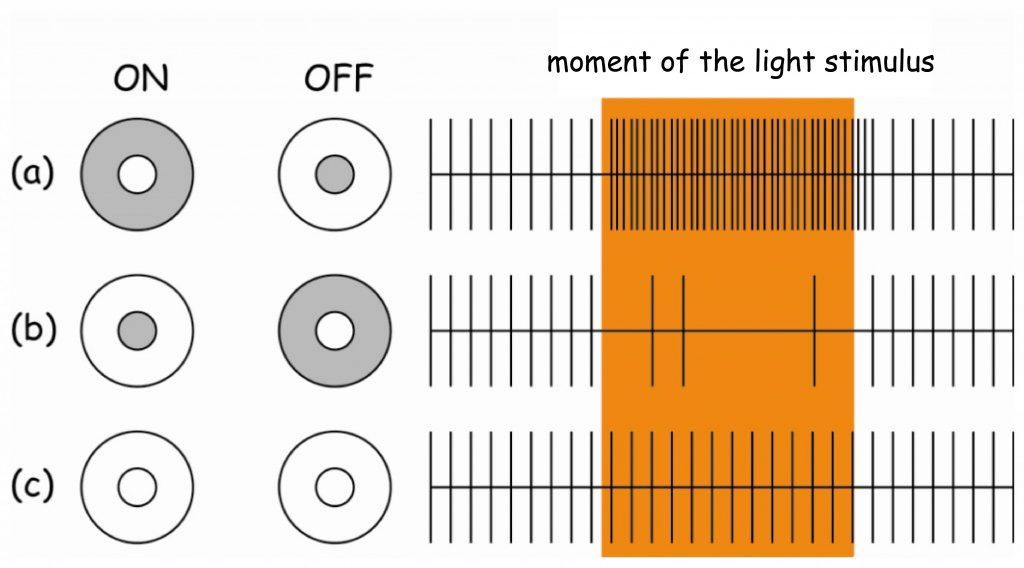
The OFF-ganglion cell will react in a very similar way when the light of lower intensity than the average intensity of light in a given retinal area falls on the photoreceptors placed in the centre of its receptive field. The ganglion cell will then inform the brain that the image projected onto the retinal area is dark (Fig. 76, line (a), column: OFF).
To sum up, the ON-channel informs the brain about the position of bright spots in a painting, whereas the OFF-channel conveys information about the position of dark spots.
If the central part of the OFF-ganglion cell receptive field is illuminated and its areola remains in the shade, the ganglion cell will not react. It is similar when the central part of the ON-ganglion cell receptive field remains dark and only the areola is illuminated (Fig. 76, line (b), columns: ON and OFF). Although ganglion cells will not react in both cases, it is also a valuable piece of information for the brain, because it says something about the brightness of different points of an image projected onto the retina. Since the number of ON- and OFF-channels in the retina is the same and they are more or less evenly distributed side by side, the brain is constantly informed about the stimulation of photoreceptors, regardless of whether they are exposed to intense light or located in the shade (Harris and Humphreys, 2002).
A slightly less “interesting” situation for the brain is when all photoreceptors in the ganglion cell receptive field record light of similar intensity, regardless of its brightness. The signal strength, transmitted by both ON- and OFF-channels, will be balanced then and the ganglion cell will react with moderate intensity, typical of its spontaneous activity (Fig. 76, line ©, columns: ON and OFF). From the point of “view” of the brain, information about the uniform brightness of a larger fragment of a painting means that a given fragment of the surface (not the edge) of some object or background is projected onto a given receptive field. According to David Hubel (1988), the interiors of planes with uniform light intensity are simply uninteresting for the brain.
Lateral inhibition as a contrast enhancement mechanism
It is time to return to the explanation of Mach illusory bands. According to his hypothesis, the lighter and darker bands visible at the meeting point of surfaces with different brightness are associated with the lateral inhibition mechanism, which consists in mutual decreasing of the activity of interconnected cells. Of course, Mach did not have the technical possibilities to verify the hypothesis empirically, yet his presumption was accurate.
Even though the receptive field of the ganglion cell clusters even several hundred photoreceptors, its surface still does not exceed 1 mm². Just like the horizontal cells form connection networks within the receptive field of a single ganglion cell, the receptive fields of various ganglion cells do not work separately, but are connected with each other. Amacrine cells, as well as other interneurons, play a particularly important role in interconnecting the receptive fields of ganglion cells (see layer 4 in Fig. 73). Both types of cells are connected to bipolar cells at the output, i.e. just before they are connected to the ganglion cell. With such a site of connection to a bipolar cell, amacrine cells have full “knowledge” of what signal is being transmitted from a given receptive field to the ganglion cell. This is also the last moment to do something with this signal. It can be either reinforced or inhibited.
Many amacrine cells only inhibit the activity of bipolar cells. However, this is not quite pointless. On the contrary – it constitutes the basis for edge detection of the seen objects. To put it simply, lateral inhibition mechanism – the activity of cells that inhibit “in sideline” the level of stimulation of adjacent bipolar cells – can be explained with a simple drawing (Fig. 77).
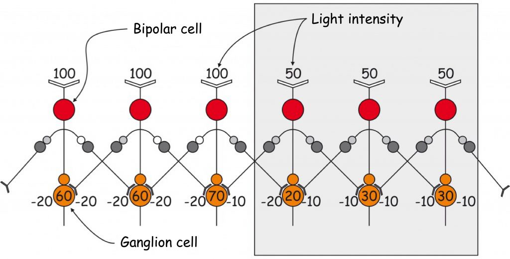
Scheme in Fig. 77 presents hypothetical reactions of six ganglion cells lying at the contact point of two areas of different brightness. Ganglion cells are connected with six receptive fields that are perpendicular to the edges of these areas. The surface is illuminated (white) on the left side and lies in the shade (grey) on the right side.
In order to illustrate the lateral inhibition mechanism, according to Gary G. Matthews (2000), we accept the following assumptions: (1) brightness of the image surface on the right side is less than half of the image surface on the left side on the conventional brightness scale (2) hindering influence of amacrine cells on a signal transmitted by the bipolar cell to the ganglion cell is 20% light intensity in a given area, i.e. in the area illuminated by 100 units the amacrine cell reduces the signal level in the bipolar cell by 20 units and in the area illuminated by 50 units the signal is decreased by 10 units and (3) each bipolar cell is connected by amacrine cells to two adjacent bipolar cells. The rest is simple arithmetic.
The first two bipolar cells on the left receive a signal with a brightness of 100 units of light stimulating them from the photoreceptors. Just before connecting to the ganglion cell, the signal transmitted by the bipolar cell is inhibited, i.e. lowered by two amacrine cells by 40 units (20 units each by the right and left amacrine cells). As a result, both ganglion cells receive information from bipolar cells that their receptive fields registered light with an intensity of 60 units (100 — 20 — 20 — 20 = 60). Similar processes take place in two bipolar cells on the right side of the graph. Because they are lit by less intense light (50 units), nearby amacrine cells lower the signal transmitted by them by only 10 units each (20% of 50 units). As a result, ganglion cells receive information about the brightness of these areas at the level of 30 units (50 — 10 — 10 — 10 = 30).
However, the most interesting are the results of subtracting the values representing the size of the signal transmitted by bipolar cells in the vicinity of the edge between two planes of different light intensity. Although a bipolar cell located on the bright side of the plane receives information about 100 units of light from photoreceptors, the total level of its inhibition by two amacrine cells is not 40, but 30 units. The reason for this is that the bipolar cell nearest to the shade is inhibited by a single amacrine cell at the level of 10 rather than 20 units of light, because the receptive field to which it is connected is stimulated by light of an intensity of 50 units rather than 100. In total, the ganglion cell receives information that its receptive field is saturated with light of 70 units (100 — 20 — 10 = 70) and not 60 units, as the ganglion cells located more to the left of it are informed. And this is the brighter Mach band on the side of the more intensely lit plane of the image.
It is enough to imagine a few dozen rows of receptive fields, analogous to the ones shown in Fig. 77, which are perpendicular to the border of light, and from one brighter point we have a whole sequence of them arranged along the bright edge of the illuminated surface.
The calculation is analogous to the first receptive field on the shadow side. The bipolar cell is also otherwise inhibited by amacrine cells lying on its right and left side. As a result, the ganglion cell receives information about a band darker than the whole surface on the right side of the picture (50 — 20 — 10 = 20). This is the darker Mach band on the shaded side of the image plane.
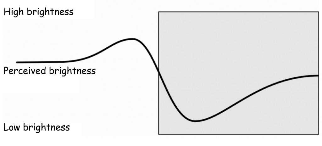
The perception of differences in brightness near the edges of two planes of different luminance is also illustrated by the graph in Fig. 78. On the brighter side of the edge, the subjectively perceived brightness of the image surface is clearly pronounced, while on the darker side of the edge, the brightness reduction is equally evident.
Obviously, it should be remembered that the edge detection between two planes of different brightness is possible as a result of the appearance of a similar signal in ganglion cells at the same time, coming from several or more receptive fields lying next to each other. It is worth mentioning that the mechanism of temporal grouping of similar signals from the retina to the brain plays a very important role in detecting the spatial orientation of identified edges. As we remember, the cells forming columns in the primary visual cortex (V1) are involved in the analysis of this edge feature for objects being viewed.
Lastly, it is worth recalling three issues once again.
Firstly, Mach bands are an illusion, i.e. they do not actually exist in the image projected onto the retina. If they were applied to a painting (e.g. by Paul Signac, Fig. 72), it was only made to emphasise their presence in the subjective experience of seeing.
Secondly, Mach bands are a manifestation of the neurophysiological mechanism used to increase the contrast among adjacent surfaces characterised by different light saturation.
Thirdly, and finally, they counterbalance the blurred vision of those parts of the picture that are projected particularly on the peripheral parts of the retina, thus increasing the likelihood of seeing the contours of the objects in those places in the visual scene.
Contour — the foundation and skeleton of the image
The use of contour drawing to depict the seen objects is the most natural and the oldest human skill. This is evidenced by both the illustrations of animals and people (dated to 20 000 – 30 000 years ago), located on the walls of the caves of: Altamira, Lascaux or Chauvet (Fig. 79), rock drawings in Gobustan (Fig. 80 A), as well as children’s drawings (Fig. 80 B). It is interesting that, although the objects we see do not usually have any edges, when drawing them we immediately use lines that signify edges when trying to present their shapes in a picture. The drawn contour line, contrasted with the background, unambiguously separates the planes that belong to the things seen and to the background, or that mark important parts of these things. At the same time, deletion of the contour exempts the visual system from conducting complex contrast enhancement operations by the lateral inhibition mechanism, because the edge is the result of this mechanism projected on the image plane. It is an artistic stylisation of lateral inhibition effects. When drawing an outline on the image plane, we show the world recorded at the output of the retina towards the brain.

It is worth realising the importance of contour discovery as a primary imaging tool. Before the first drawings or stone carvings appeared, our ancestors only carved spatial objects. Most often they depicted women or animals and musical instruments.

About 30,000 years before Christ, or perhaps even earlier, humans discovered that three-dimensional objects — even if they do not have contours — can be represented on a flat surface with the use of a scorched piece of wood or a finger dipped in mud. I believe that this discovery, being the expression of the ingenious intuition of our forefather, belongs to the canon of milestones in the history of human civilization, equally as the mastery over fire and formation of the verbal language foundations, based on the use of conventional signs. Indeed, it is hard to imagine at what stage of civilization development we would be at present if our ancestors did not master the ability to present the world in a flat picture. It may be that we would still be waiting in our caves for the brilliant Leonard of Chauvet.
Between the Upper Palaeolithic and contemporary times
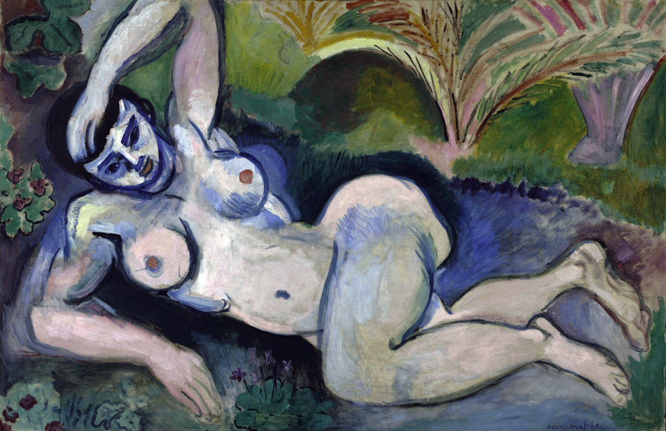
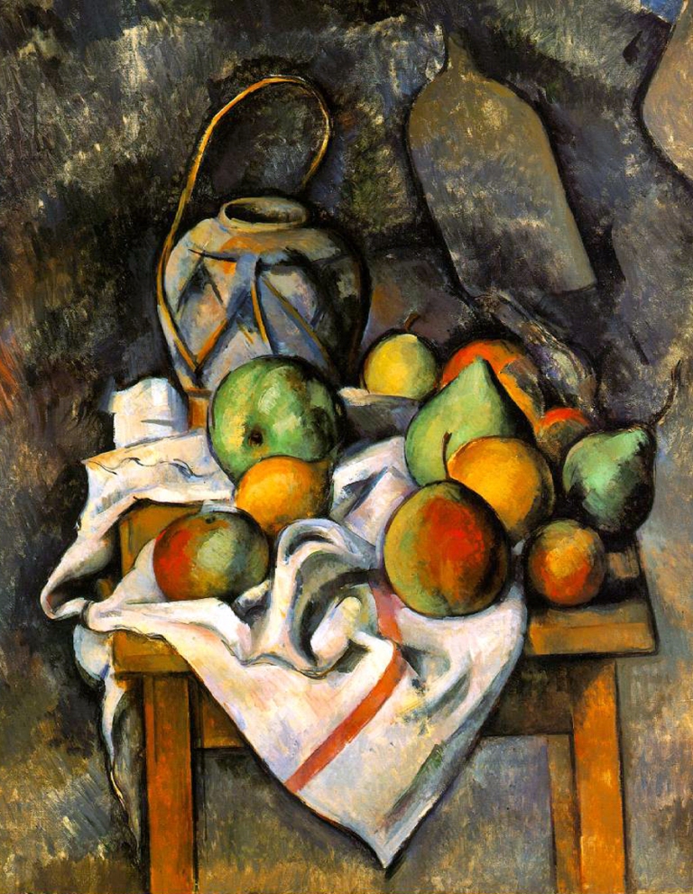
Although the history of art provides many examples of the use of contour lines as a means of artistic expression, in Western European paintings they were for many centuries used almost exclusively to prepare sketches, which were then carefully hidden under a layer of paint. It was not until the revolution in art at the turn of the 19th and 20th centuries that the contour ceased to be merely an element of auxiliary drawing but it was included in the arsenal of modern means of expression. Artists such as Paul Cezanne, Henri Matisse, Pablo Picasso and Roy Lichtenstein, as well as many other contemporary artists, not only did not hide the contours of the painted objects and their parts but, on the contrary, they clearly separated them from each other with strong strokes of brushes, achieving a completely new artistic quality (Fig. 81 A, B, C and D).


In such method of painting one can notice echoes of the method used for depicting the world thousands of years ago. Although there is no confirmation of Pablo Picasso’s presence in the guest book of the Cave of Altamira, it is him who is credited with the famous sentence that “after Altamira, everything is decadence”.
From a distance or at a close range: Camille Pissarro vs Pieter Bruegel the Elder
We see objects from different distances. We see more of their details at a close range, and none or less from a distance. The loss of the clarity of details as a derivative of the distance from an object being seen is increasingly felt in relation to those elements of the image that are projected onto the peripheral areas of the retina rather than onto the fovea. This undoubted weakness of the visual system, however, is by no means a major limitation for painters. On the contrary, visual experiments in which artists use variable eye resolution to convey different content to their recipients are not uncommon. The works of many artists from various periods and painting traditions are the evidence for that.
To start with, it is worth confronting two paintings that are separated by over 300 years of experience and reflection on visual art. The first painting, closer to our times, was created in Impressionist style, the second one belongs to the early Renaissance tradition of Flemish painting.
Pissarro’s painting (Fig. 82) is the example of Impressionist painting which is characterised by a typical lack of care for the shapes of the depicted objects, sharply marked flashes of light and thickly laid paint. What does this painting represent?
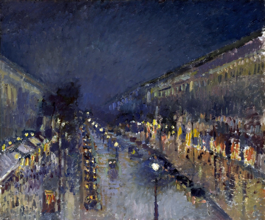
This question can be correctly answered only if the retinas of the eyes of the observer do not register it very accurately, i.e. through the peripheral parts, which are characterised by low resolution, or as a result of increasing the distance from which it is seen. As the distance between the fovea and the object being seen increases, the fewer cones register the same picture plane and thus the resolution of the picture decreases.
An interesting visual phenomenon occurs with respect to Pissarro’s work. Paradoxically, the more clear the details of the scene depicted on the painting, the lower their resolution (obviously, e.g. at 500 metres distance, we would probably hardly see any painting on the wall). The solution to this paradox lies not in the painting, but in the mind of the observer.
Let us see how the analysed painting looks at close distance. The lower left fragment in shown in a close-up in Fig. 83 A. When we look at this fragment in the context of the whole painting (i.e. at a certain distance), then we have no doubt that it presents a piece of pavement, a crowd of passers-by, illuminated shop windows and a telephone booth with a lighted light bulb inside.

After performing a close-up and edge detection based on the brightness of the adjacent picture planes, we can say that the shape of any object found in this fragment of the painting does not resemble any human being (Fig. 83 B). It is simply impossible to see people here as well as all the other objects mentioned without reference to the whole painting. We only see irregular spots surrounded by edges, which by no means can serve as a basis that enable the viewer to construct any sensible scene.
So how does it happen that on the basis of irregular, colored spots and edges which do not produce significant figures in a close-up we can see anything in Pissarro’s painting? This question cannot be answered by referring to sensory data only, i.e. the data being transferred from receptors to the brain (i.e. bottom-up). For proper interpretation of this painting, references to previous experiences of viewing similar scenes are necessary. These experiences are recorded in the observer’s brain and somehow applied top-down to the scene being watched. This is how the painting’s content is produced “in the mind” of the recipient – by projecting their own memories on the ambiguous plane of colorful spots and shapes. And that is how a sensible scene is created.
Although one may disagree with David Marr’s assumption (1982) that all items of information for recognising objects being seen are available from the retina, many of them provide useful hints for interpreting this scene undoubtedly. Viewing Pissarro’s painting from a greater distance certainly does not improve the sharpness for detail view of individual objects. However, the greater distance enables to see general outlines of the order of objects depicted in the painting. By blurring the details, larger fragments of the painting merge with one another, which form regular structures, delineated by the illusory lines of perspective (Fig. 84).
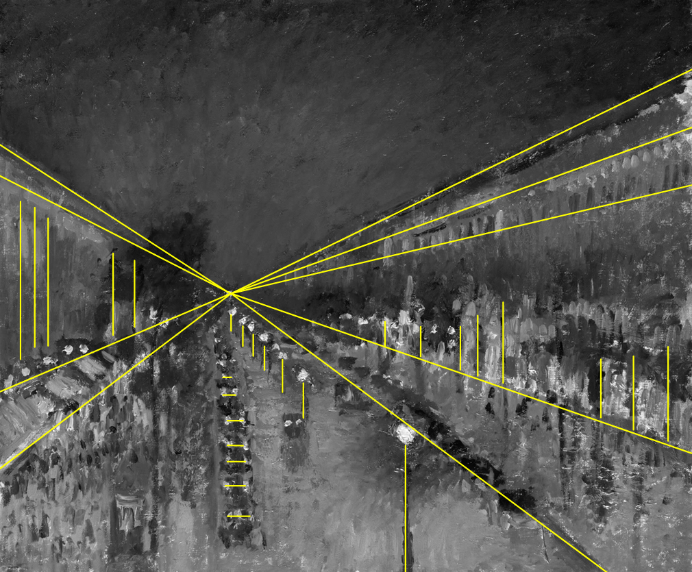
First of all, it turns out that the painting has been painted in accordance with the Renaissance perspective rules, codified by Filippo Brunelleschi (Gombrich, 2009; Janowski, 2007). Perspective lines divide it into at least four clearly separated parts: the top part (without additional lines), two side parts (with a predominance of vertical lines) and the bottom part (with horizontal and vertical lines). Noticing this order is the basis not so much to see but to remember the details of similar paintings depicting a street and superimpose them on this scheme.
The reverse side of Pissarro’s The Boulevard Montmartre at Night is The Procession to Calvary by Peter Bruegel the Elder. The painter placed over 500 human figures and nearly a hundred different animals and objects on the surface of the painting less than 1 m² (Fig. 85).

Therefore, on the basis of a general view of the work, even the tenth part of what is its content cannot be surmised. All one needs to do is look at a few fragments of the painting to understand how many stories, anecdotes and symbols it contains. Each of these fragments could constitute a separate painting. Each of them is subject the same laws of perception, which make it possible to identify the contours of the figures located in each visual scene (see Fig. 86). The only condition for seeing them is moving closer to the painting. By moving one’s eyes from one place to another, Bruegel’s work is read like a book. It is not only a representation of space, but also of the change in time, marked by other stations of the Cross placed in different parts of the painting.

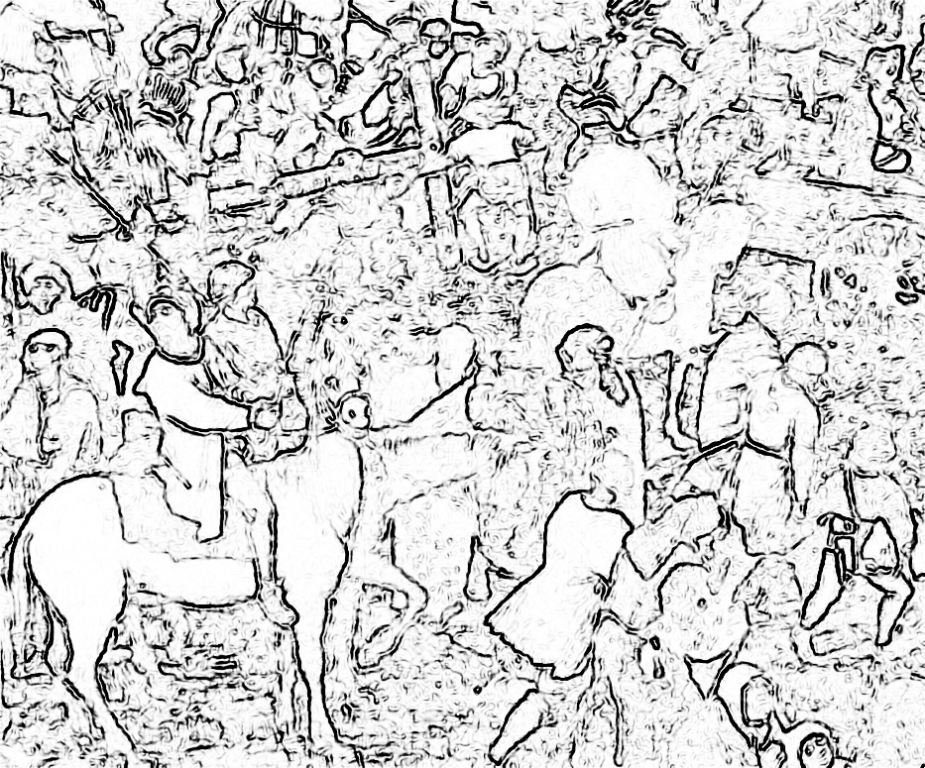
Comparing the contours of the objects painted by Pissarro and Bruegel (Fig. 83 B and 86 B), we immediately notice the difference in the concept of representation of the visual scene in painting. The easily recognisable shapes of horses, people and objects in Bruegel’s painting correspond to the projection, almost random, Pissarro’s spots. Both painters use the eye resolution of the observers (who admire the artistry with which they present their own vision of the scene being watched) differently. What connects them, however, is that they leave the recipient no choice. Either their works are viewed from a certain distance or it is not known what is depicted on them.
From Mannerism to mozaika.com
When it comes to consideration regarding the sharpness of paintings viewed from different distances, it is worth paying attention to several other examples of visual art works. Unlike Pissarro’s and Bruegel’s works, they all present fundamentally different content when viewed from a close or far distance. Their parts being seen from a close distance are as sensible as the figures in Bruegel’s paintings, but they blur and transform into new content (as in Pissarro) with the increase of the distance from the painting. There is a little of magic and illusion in this, but, above all, they are a manifestation of experimenting with the possibilities of the human eye by “ignorant neuroscientists” (cf. Ramachandran and Hirstein, 1999; Zeki, 1999).
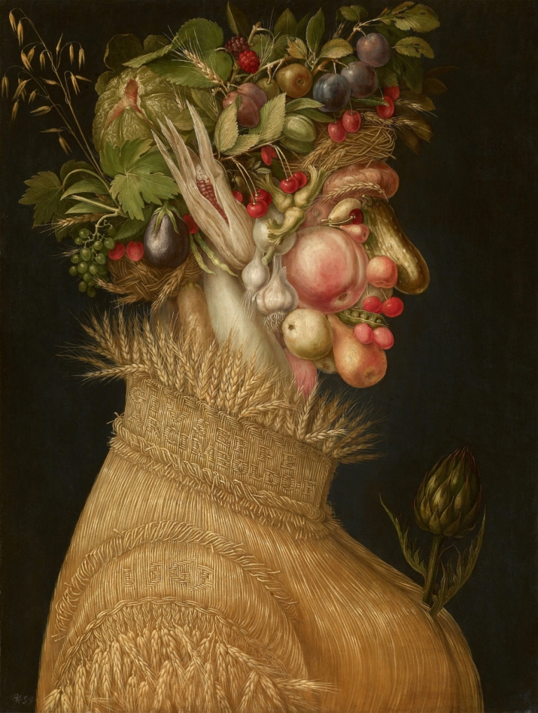
One of the precursors of Surrealism is the Italian Mannerist, Giuseppe Arcimboldo. His passion was painting in such a way that his paintings depicted still life composed of vegetables, fruit, leaves and flowers when viewed closely, while, when viewed from a certain distance, they depicted portraits or genre scenes. Arcimboldo also paid equal attention to the possible faithful representation of the components of the portrayed figures, as well as to highlighting their specific facial features (Fig. 87 A and B).

Mexican artist, Octavio Ocampo, a Surrealist and precursor of contemporary polymorphic painting, conducts similar experiments on changeable resolution of viewing paintings. Similarly to Arcimboldo’s paintings, Ocampo’s paintings sometimes also has two, even more, layers of content that are discovered depending on the distance from which they are viewed. The almost six-metre long fresco on the wall of the Information Center of the Technological Institute of Celaya, Mexico, gives a special opportunity for this (Fig. 88). Three faces of a prehistoric hominid, homo sapiens and Albert Einstein are viewed from a distance almost immediately, but only in a closer look they turn into a group of runners, symbolising human evolution.
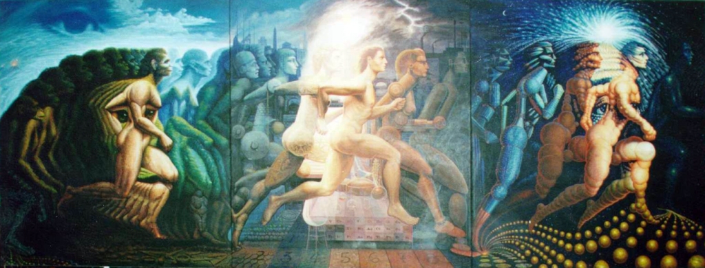
When painting the fresco, Ocampo particularly made sure that the faces dominated the attention of viewers. This is clearly revealed by the contour analysis conducted on the basis of the monochrome version of this fresco (Fig. 89).
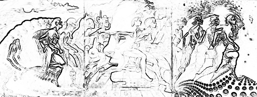
The outline of the face definitely dominates the outline of running people and it is not until we see the face that we realize which elements they are composed of.
The oculographic data collected during the tests conducted in our laboratory that were already mentioned in this chapter (see description to Fig. 69) provide one more interesting hint regarding the perception of the human face, in particular the eyes. We showed the reproduction of the Ocampo’s Fresco to our test subjects and while they were watching it, we recorded the movement of their eyeballs. It turned out that facial recognition immediately directs the attention of the human test subjects towards the eyes which become the most important elements of the painting (Fig. 90; arrows pointing to the right).
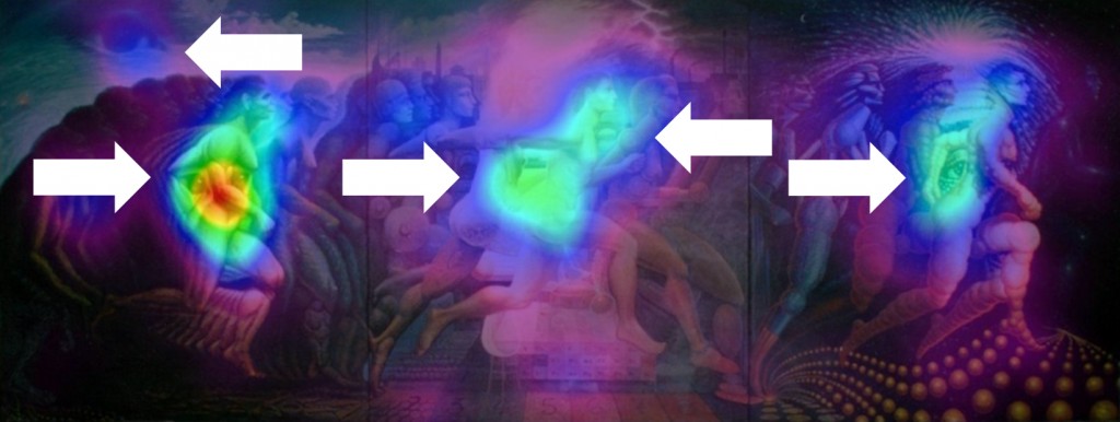
The strength of the eye detection mechanism in the visual scene is also confirmed by two bluish spots. The first spot can be found in the upper left corner of the painting, where the “Divine eye” is located. The second spot is located in the middle of the painting (Fig. 90; arrows pointing to the left). The interest of the test subjects in the shape located in the middle of the painting is especially interesting, because there is actually no eye in this place, but the shape of the outlined figure present there, in combination with the facial image, suggests such a possibility.
A similar idea was implemented a few years earlier by Salvador Dalí. On the wall of his theater-museum, he painted a portrait of his naked wife – Gala, looking out the window. This excellent work, in one of its several versions, combines both concepts of using different ranges of vision resolution, depending on the distance from which it is viewed (Fig. 91).

With his characteristic brilliance, Dalí offers the recipient at least two paintings in one, depending on the distance from which they are viewed. The closer of these distances enables to see the figure of a naked woman and also the crucified Christ from sky perspective. They were painted with great care. The contours of these figures can be isolated easily, although the connections between them do not explain each other without the reference to facts of the artist’s life history, and, in particular, the period in which the painting was created. However, if the painting is viewed from a greater distance, e.g. 20 metres, which is possible in the place of its exposure, then the observer’s eyes can see the characteristic outline of Abraham Lincoln’s bust (Fig. 92 A). Deterioration of visual acuity (for example, achievable by squinting) enables seeing a new order of things encoded in the painting and applying to it the characteristic facial features of one of the most famous images of the president.

For comparison, I present a photograph of the bust of the US President in Fig. 92 B, which (in Fig. 92 C) has been manipulated in the same way as Dalí’s painting.


Another image that well illustrates the discussed phenomenon of variable resolution of vision, depending on the distance from which it is viewed, has been created automatically by the Mozaika [Mosaic] V3.5 programme. The idea of this programme’s functioning concerns the use of the existing digital photo or clipart collection to create a new image in such a way that for each source photo the programme determines its dominant color and brightness, and then determines its place in the new mosaic image on that basis (Fig. 93 A and B).

In 2008, for the use of Barack Obama’s first presidential campaign, Anne C. Savage, a photographer, prepared a poster-mosaic composed of 6.000 color photographs of faces (Fig. 94). In this way, she wanted to express her impressions of Obama’s rallies, in which countless crowds of listeners participated. The principle of developing this poster is the same as using the Mozaika [Mosaic] programme. Therefore, if someone wishes, they can attempt to find their photograph among others, e.g. around the Chief’s eyes (Fig. 95).


And finally, a unique mosaic designed for the beatification of Pope John Paul II (Fig. 96). His beatification portrait was printed on canvas measuring 55 x 26 m (1.400 m²) and hung on May 1, 2011, on the facade of the Temple of Divine Providence in Warsaw’s Wilanów. What is most remarkable in this picture is that it was created from composition of 105 thousand photographs sent by the Poles for this occasion. On the website portretjp2.com.pl you can see this mosaic at close distance and even find the place of your photograph (obviously, if it was donated for this purpose and we are really lucky).

Contour of objects and chiaroscuro
After a journey to the mosaic world of pictures viewed from close and far distance, it is time to revisit the issue of seeing the contours of objects, in particular, three-dimensional ones. Vision is given to us to primarily recognise objects on the basis of contours and to behave towards them in an adequate manner. Their contour, however, is not enough, since where there is light, there is also a shadow which also has its own contour. For the visual system, therefore, there arises the problem of differentiating the contour of objects from the contour of the shadow they cast. Therefore, the eyesight must also deal with this complication towards recognising the object.
Objects are seen by means of the light falling on them, which is reflected by them and falls onto the eye, placing their image on its back wall. The type of image that appears on the retina’s “screen” depends not only on the intensity of light, but also on its length and direction. The light can be diffused or directional, as well directed to an object from different sides. All these factors have a direct impact on the contrast of the visual scene and, consequently, on the clarity of the contours of viewed objects, as well their recognition.
These few obvious sentences make us aware of the tasks that the eye (and then the brain) have to deal with in order to correctly recognise the visual scene. One of the obstacles is the shadow cast by objects. The object shown in Fig. 97 A is a damaged axle with toy car wheels.
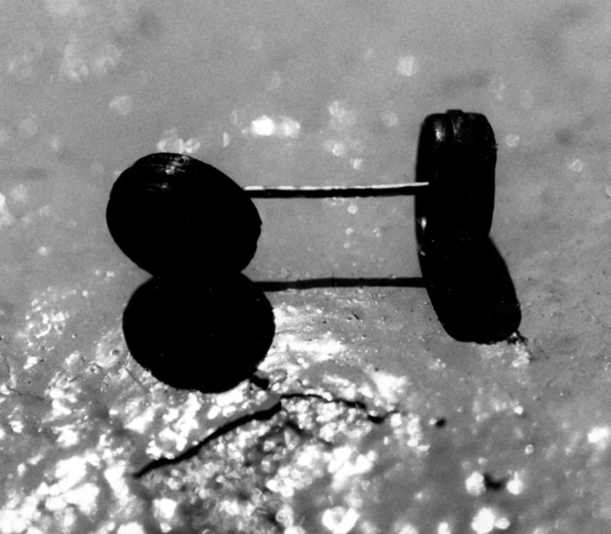
The object was illuminated from behind with directional light with medium intensity. Since the wheels are black, just like the shadow they cast, it is not easy to recognise what this object is at first glance. The outline of contours, established in accordance with the procedure adopted in all such analyses in this book, constitutes a perfectly illustrated basis for this difficulty (Fig. 97B). The object and its shadow merge into one, expressive, although completely unknown, shape. Only rejecting the hypothesis that the entire contour outlines one object, directs attention to other elements of this image (e.g. reflections of light on wheels and a steel axle connecting them, which do not appear on the shadow). Establishing and verifying perceptual hypotheses is, however, a completely different story that is beyond our consideration and concerns the areas of higher mental processes.

The above-mentioned David Marr and Ellen C. Hildreth (1980), as well as Marr (1982), attempted to handle the problem of formation of object representation on the basis of its contour, which may be “distorted” by means of e.g. chiaroscuro. Analysing the contours of objects and their shadows, they pointed out that the contour of a cast shadow is generally much less regular and wider than the object’s contours (Fig. 98 A and B).

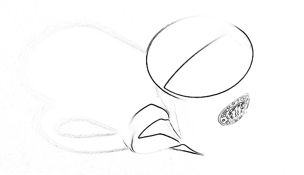
This difference in the shape of both contours is significantly influenced by the texture surface on which a shadow is cast. Even a much less regular edge of an object than the edge of a porcelain cup, in ninety-nine cases per one hundred, will cast a shadow with an even less regular edge. It seems that the assumption concerning the difference in the contours of objects and their shadows refers to such a large number of cases which we encounter on everyday experience that it can be considered as sufficiently justified. Therefore, everything indicates that the visual system has a special mechanism to differentiate the quality of the contour in order to separate the edge of the object from the edge of its shadow, and, on this basis, to accurately recognise the viewed object.
It should be mentioned that the problem of actual and illusory contours is solved almost immediately if the photograph with a mug (Fig. 98) is seen not through the perspective of still photography but through the perspective of everyday experience of watching objects in three dimensions and thus being in motion. We can look at this object from different perspectives and we will quickly notice its new contours. The observer’s movement as well as the movement of the object play an extremely important role in the accurate recognition of objects. The two-dimensional picture prevents this kind of analysis and that is why the use of special tricks to highlight the spatiality of objects is required.
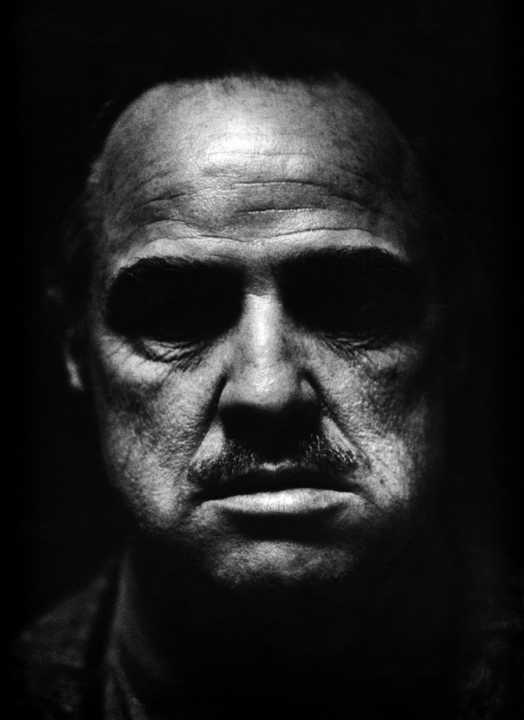
The use of shadow is one of the most important elements of the language of images. It was the inseparable shadow cast by eyebrows on Don Vito Corleone’s (Marlon Brando) eyes, which gave his face an expression of mystery in the film The Godfather, while in the photograph of cyclists, the shadow enabled the inversion of the natural order of things. In this case, it is the shadow that casts the object (Fig. 99 A and B).

Illusory contours
The problem of separating the edge of the object from the edge of its shadow is at least as complex as the problem of recognising the object whose image has been deprived of some fragment of the contour, e.g. by excessive lightning (see the right part of the cup in Fig. 98), similar brightness or color in relation to its other parts or the background it is on. Then, the presence and location of the outline lines can only be guessed. Despite the fact that the eye is equipped with excellent mechanisms for extracting the shapes of objects seen, nevertheless, without mechanisms at later stages of the visual pathway, it would be impossible to solve this problem. Rüdiger von der Heydt, Esther Peterhans and Günter Baumgartner (1984), von der Heydt and Peterhans (1989) and Peterhans and Von der Heydt (1989) stated that the same cell groups in the V2 cortex of primates react similarly to both readily identifiable and illusory contours. The results of analogous human studies have revealed that the perception of illusory contours involves significantly more brain areas than in primates (see Mendola, Dale, Fischl, Liu et al., 1999).
An interesting illustration of the illusory contours can be found, for instance, on posters by Hans Rudi Erdt (see Zelanski and Fisher, 2011; Fig. 100 A and B). Many of the clothing, body parts, or faces of people depicted on these posters are not separated from other parts, nevertheless, we have no doubt about their shapes. The previous visual experience, which tells where the outline lines should be located, also plays a huge role.


Even more sophisticated experiments on the implied contours in the painting were conducted by the above-mentioned Octavio Ocampo (Fig. 101). The lack of many outline lines is not the only characteristic of his compositions. This surreal vision of objects (flowers, butterflies, birds and trees), almost scattered all over the painting, does not prevent you from seeing both the illusory outlines and the subtle, girlish features of the painted faces.


Sfumato: from Leonardo da Vinci to Wojciech Fangor
Studying the contours of painted objects led Leonardo da Vinci to develop his favourite painting technique, called sfumato. The Italian word sfumato means foggy, vague. This technique involves blurring the lines between the light and dark planes of the painting. On the one hand, this causes the edges of objects to be blurred and sometimes even impossible to identify. As a result, the visual system responsible for edge detection cannot separate surfaces belonging to different objects from one another. On the other hand, however, the ambiguous lines between the object and its background, or among its parts, allow for a less limited interpretation of what it is seen.
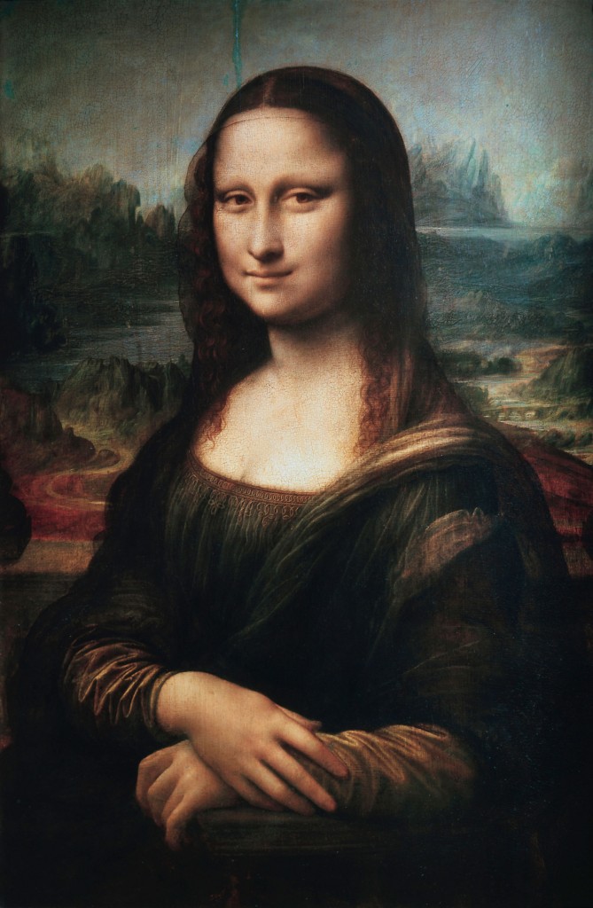
In a sense, the lack of unambiguous contours enlivens the painting, makes it more mysterious and metaphorical, and thus more interesting. Among others, Ernst Gombrich (2005), Robert L. Solso (1996) and Mengfei Huang (2009) explain in this way the mystery of Mona Lisa’s smile (Fig. 102 A), whose lips and eyes do not have any sharp features, but only their remainder that enables their different interpretations. “Sometimes it seems that she mocks us, another time it seems that we see sadness in her smile. This all sounds quite mysterious and so it is; such impression is often made by great works of art,” states Gombrich about his impressions concerning contacts with Liza (2005, p. 300).
Using the contour analysis method based on the brightness distribution, it is very easy to verify the hypothesis explaining the ambiguity of Mona Lisa’s facial expression (Fig. 102 B).
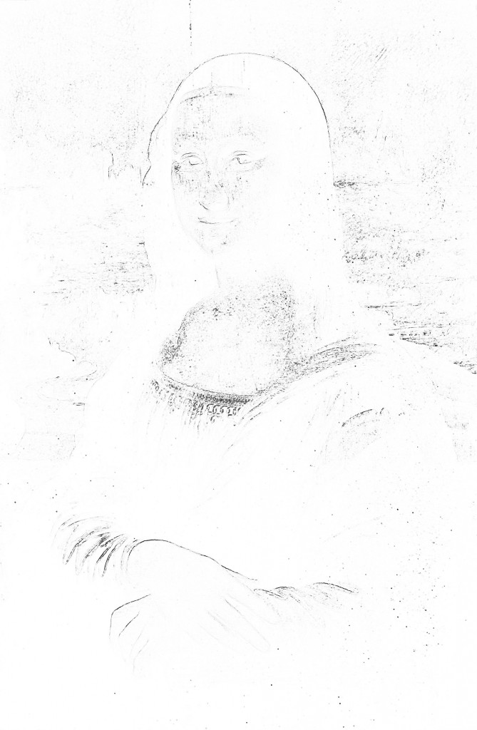
It transpires that while the outlines of the eyes are still quite clear, the edges of the nose and mouth are much less visible. They are just a subtly drawn sketch, not a finished version that clearly defines the model’s facial expression.
An excellent example of the use of the sfumato technique by Leonardo da Vinci, who even better reveals the properties of this technique, is the painting Saint John the Baptist, painted between 1513 and 1516 (Fig. 103 A). Leonardo was emotionally attached to this painting no less than to the beloved Mona Lisa. He had never sold it and wanted to have it on his deathbed.
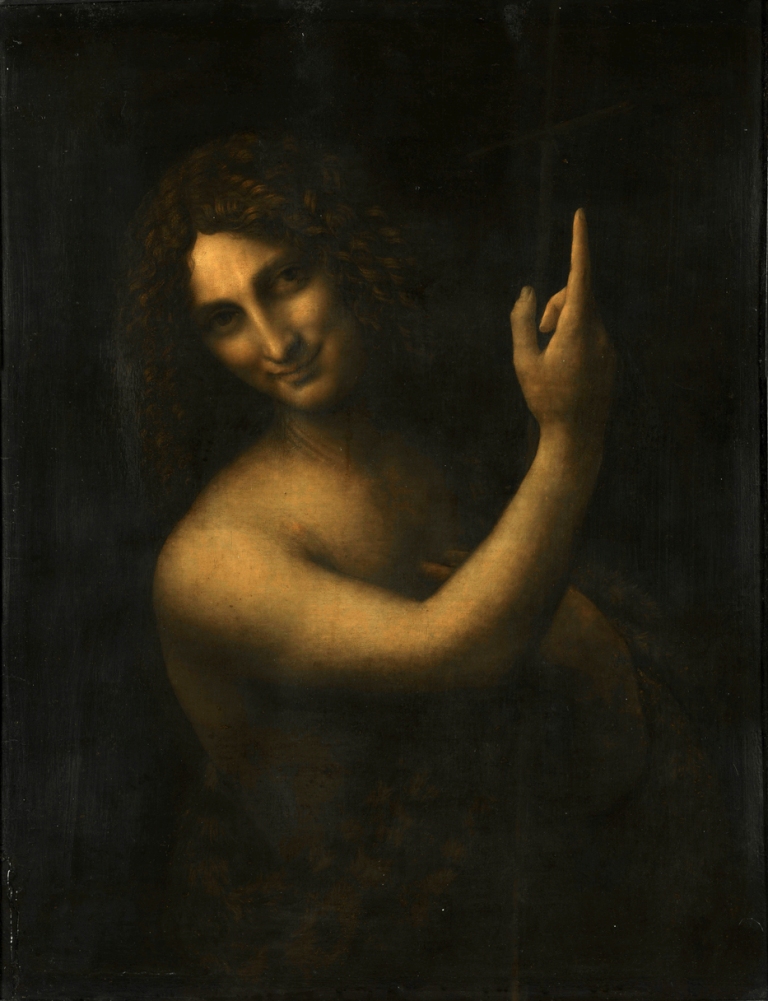
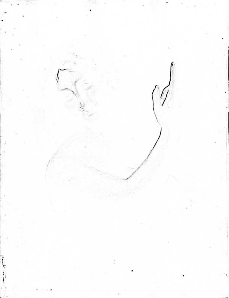
The result of the analysis of this painting with the use of brightness/contrast filter reveals a serious problem concerning determination of the outline lines (Fig. 103 B). Most of them cannot be seen at all, because the range of tonal transitions between the light spot of the body and the dark background is so wide that it is impossible to tell where the background ends and the figure of the prophet begins. John the Baptist emerges from the thick darkness like an apparition and only the inner part of the arm and hand with a raised index finger as well as a small part of the forehead are visible more clearly. Even his face is highly ambiguous. It might be both male and female face, mature or youthful, smiling or serious. Through the form of character presentation, the painting encourages the recipient to project their own memories, moods and needs. This is all because the visual system has difficulty in identification of the contour lines.
The sfumato technique was also often used by other Renaissance artists, e.g. Raphael Sanzio and Georgione. This technique is also used nowadays. Wojciech Fangor, the Polish painter, obtained interesting optical effects by means of this technique. Its multi-colored circles with blurred edges pulsate, increase and decrease; they are active, as if they were alive (Fig. 104 A). All these effects result from a main difficulty in determining the edges of the figures viewed by the observer’s visual system (Fig. 104 B).


How light creates the contour in Georges Seurat
Georges Seurat also played with the contour line of the objects he viewed. He did not actually use the contour of the object like the line separating the object from the background or from other objects in the scene. Through a subtle change of hue, saturation or brightness, and diligently juxtaposed thousands of colored dots, he emphasised only the presence of a new object. In this way, the light brown tree separates from the Seine’s blue water, and white sails separate from the sandy shore (see Fig. 105 A).
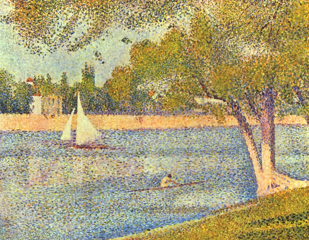
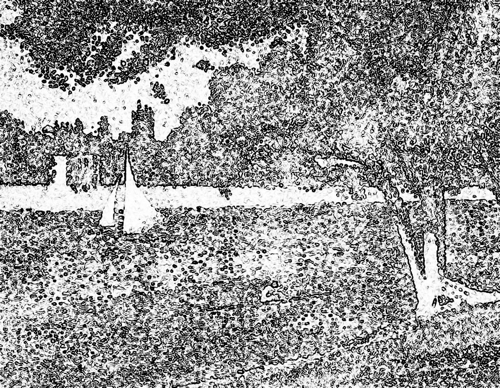
Subjecting the painting to contour analysis, we obtain a completely opposite effect than the one we observed after conducting an analogous analysis, for instance, in Saint John the Baptist by Leonardo da Vinci. In Seurat, the excess of contour lines is overwhelming (Fig. 105 B). The visible edges of tree trunks or sails are by no means the result of a line outlining their shapes, but the result of the density of hundreds of small lines surrounding individual points of this pointillist composition. Furthermore, it would be in vain to look for some objects in the contoured version, if we did not see them in the original, e.g. a canoe and a girl in a bright dress, with a red flower in her jet black hair, sitting in it.
The effect of the disappearance of the canoeist in the contour version, although she is clearly visible in the original version, made also this painting listed among the bestsellers shown to thirty-eight people examined in the oculographic experiment mentioned in this chapter, which we conducted with Anna Szpak. The results of the study have revealed an interesting regularity. It turned out that the canoeist is the most-viewed object in the painting (Fig. 106). However, this may be only the interest in the only human figure in the scene. Nevertheless, it cannot be ruled out that in addition to edge detection based on contrasts of brightness, the visual system is also equipped with another coding mechanism for shape recognition. It is a color detector, which, in the case of this painting, provides slightly different items of information than a luminance analyser.